Sakarit is a Graphic Designer & Visual Artist, based in Brooklyn, NYC | E: [email protected]
This project examines the VERLAG typeface, designed by Hoefler&Co, and its potential applications across various media, scales, and materials.
This project showcases the Verlag typeface, originally designed by Hoefler&Co. for the Guggenheim Museum and later expanded into 30 commercial variants. The typeface’s versatility is explored through applications on various materials.
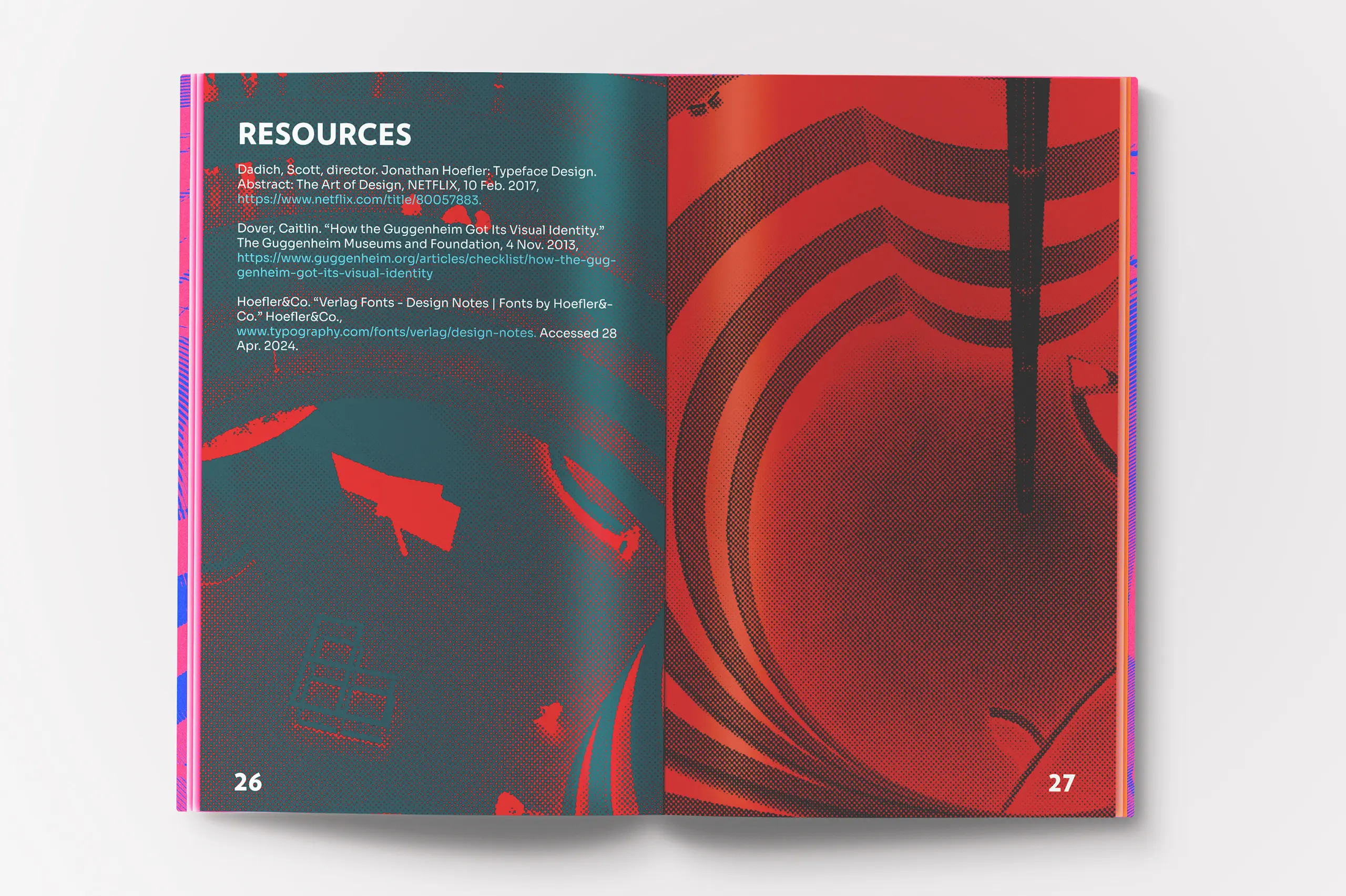
A booklet was created to document these studies, highlighting how Hoefler&Co. carefully crafted Verlag for use in both the Guggenheim Museum’s collateral and other commercial projects.
The project highlights the adaptability of the Verlag typeface by applying it to materials such as wood, plastic, fur, stained glass, and mixed media, showcasing its versatility across various mediums.
The booklet reimagines Verlag with bold, contemporary, and vibrant colors while maintaining elegance and presenting informative study data.
Additionally, motion graphics were created to appreciate the typeface’s perfection in dynamic formats, preserving its art deco-inspired aesthetic while integrating maximalist elements, further emphasizing its adaptability.
This study showcases the craftsmanship of Hoefler&Co and encourages designers and typographers to create typefaces that are adaptable to different formats and materials, ensuring both longevity and sustainability for decades to come.
Each letter and glyph is carefully crafted for versatility across layouts, reflecting the elegance of Art Deco while maintaining timeless beauty. This project demonstrates how type can blend with various styles while remaining ready for new creative realms.