SAKARIT

Typorganik Display — 156 Variations

Type & Font Design, Apparel/Merch Design
Press play for the full experience!

The music here isn’t just background noise. It’s pure energy meant to bring the visuals to life and make the whole experience feel more playful and alive. I know music is personal, but for this project, the sound is a huge part of the story. Turn it up and enjoy the vibe!

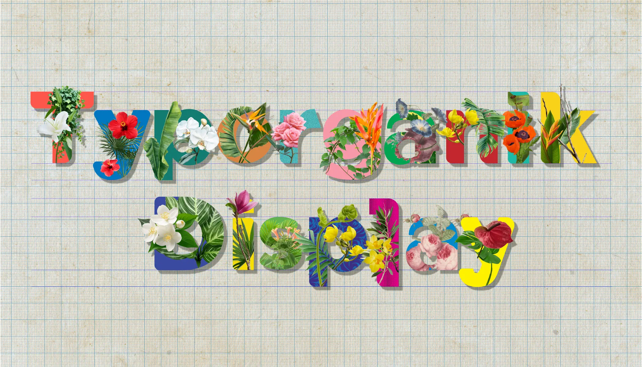
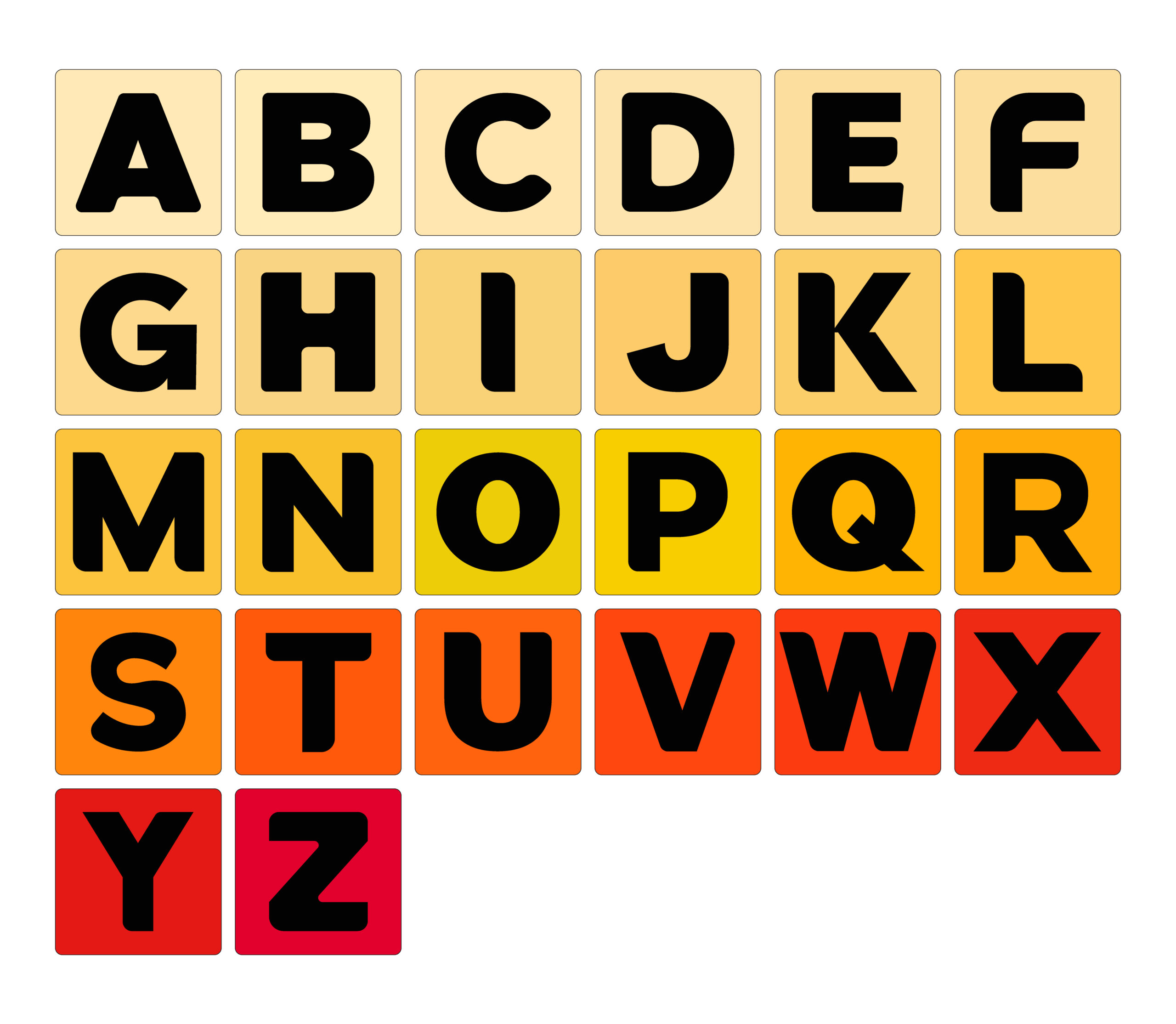
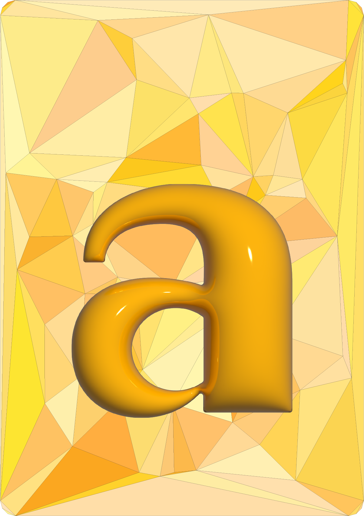
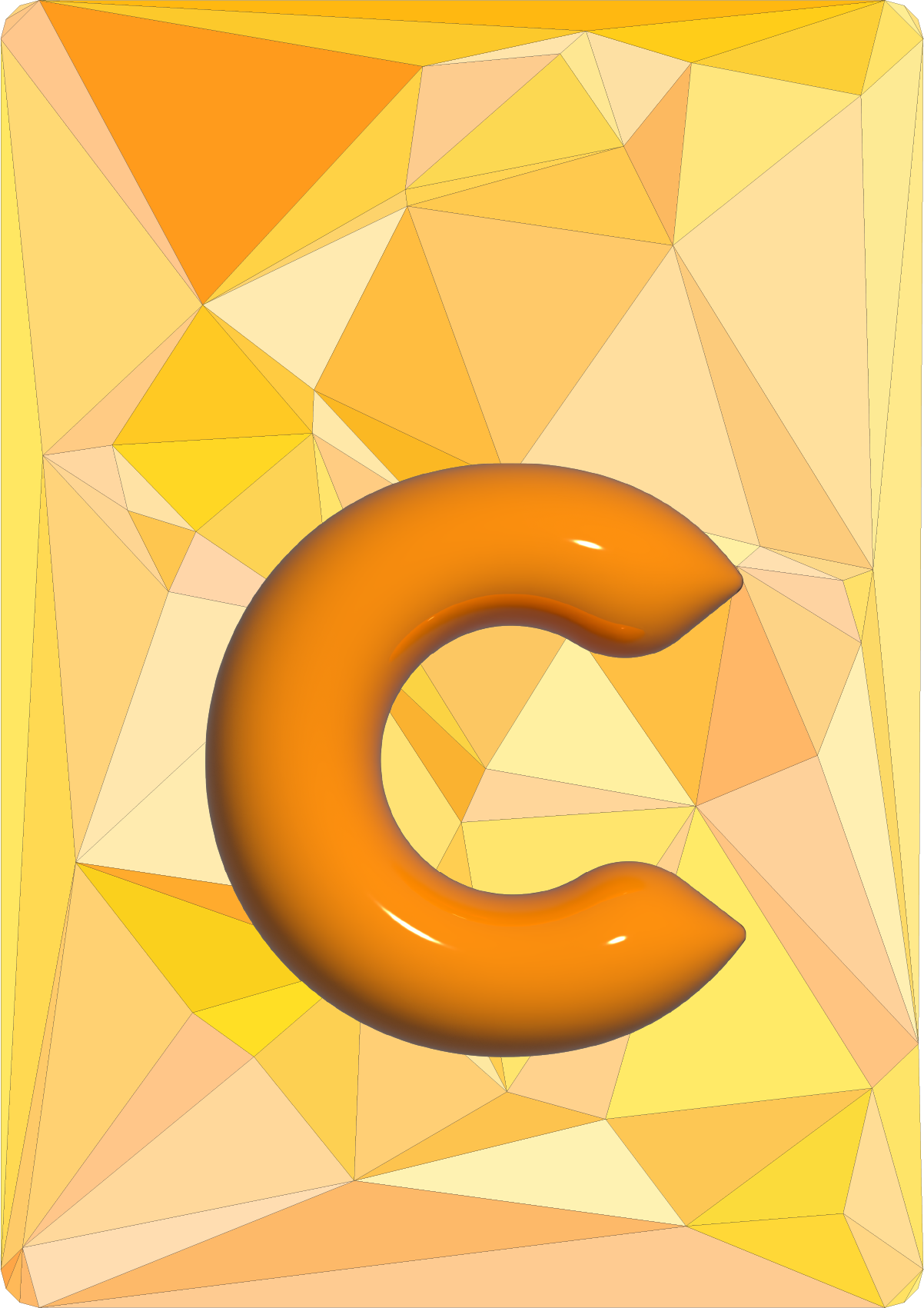
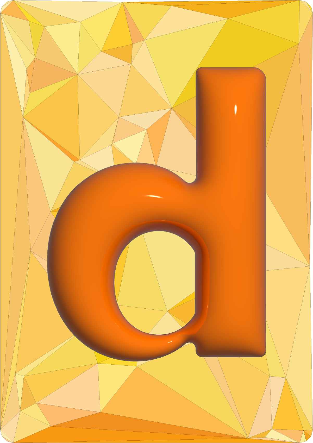
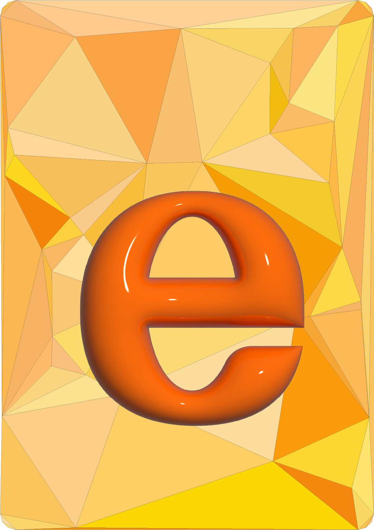
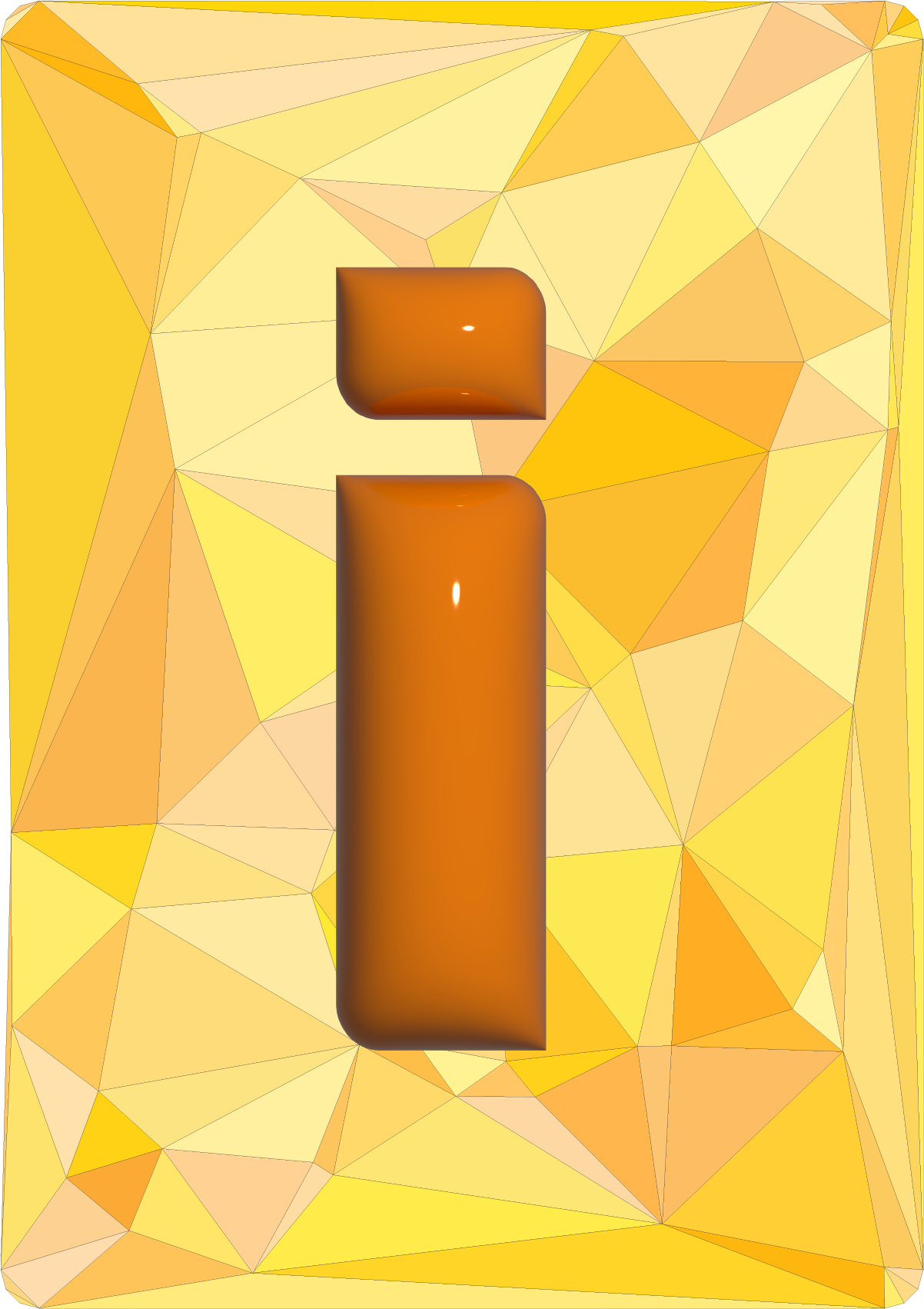
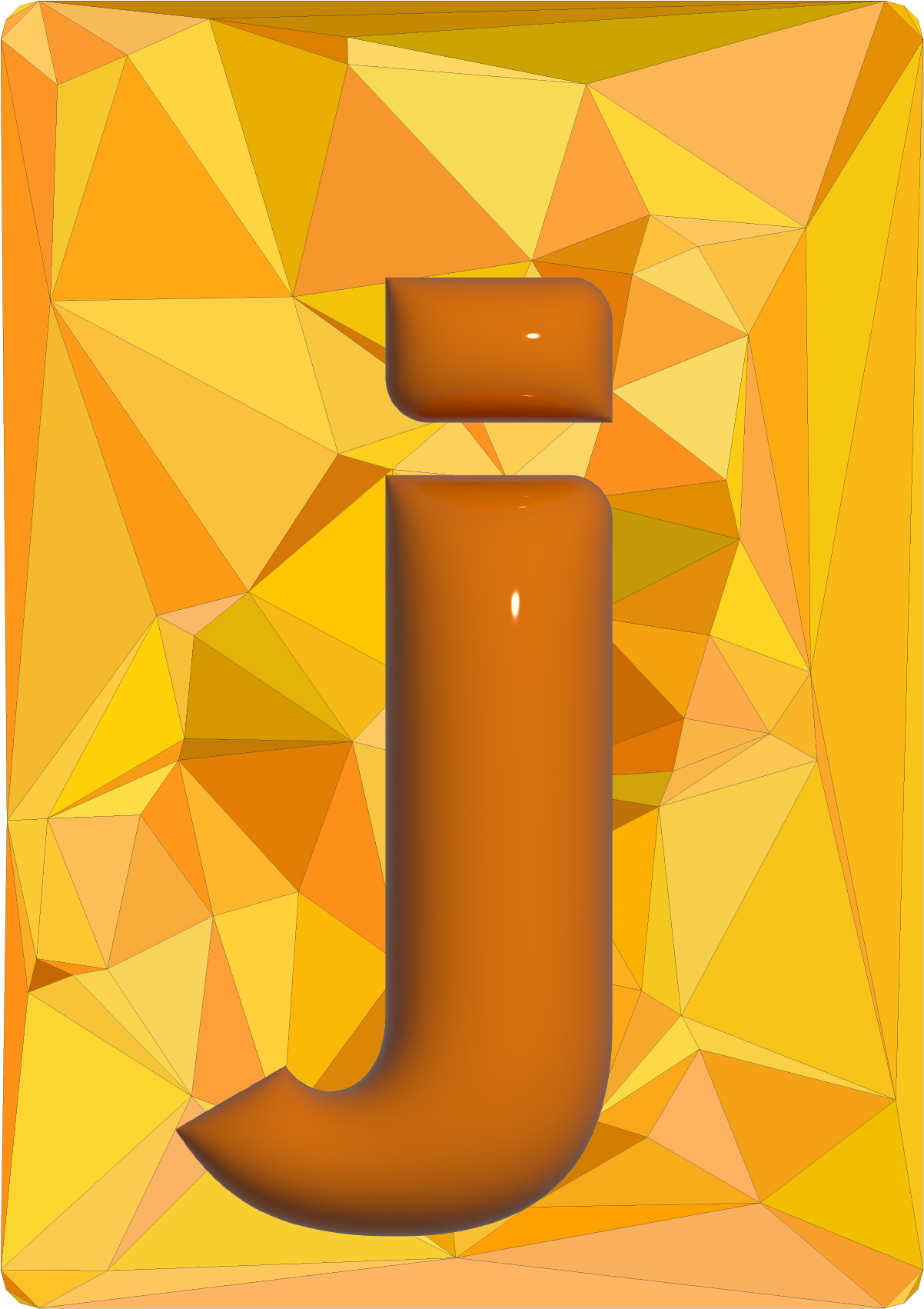
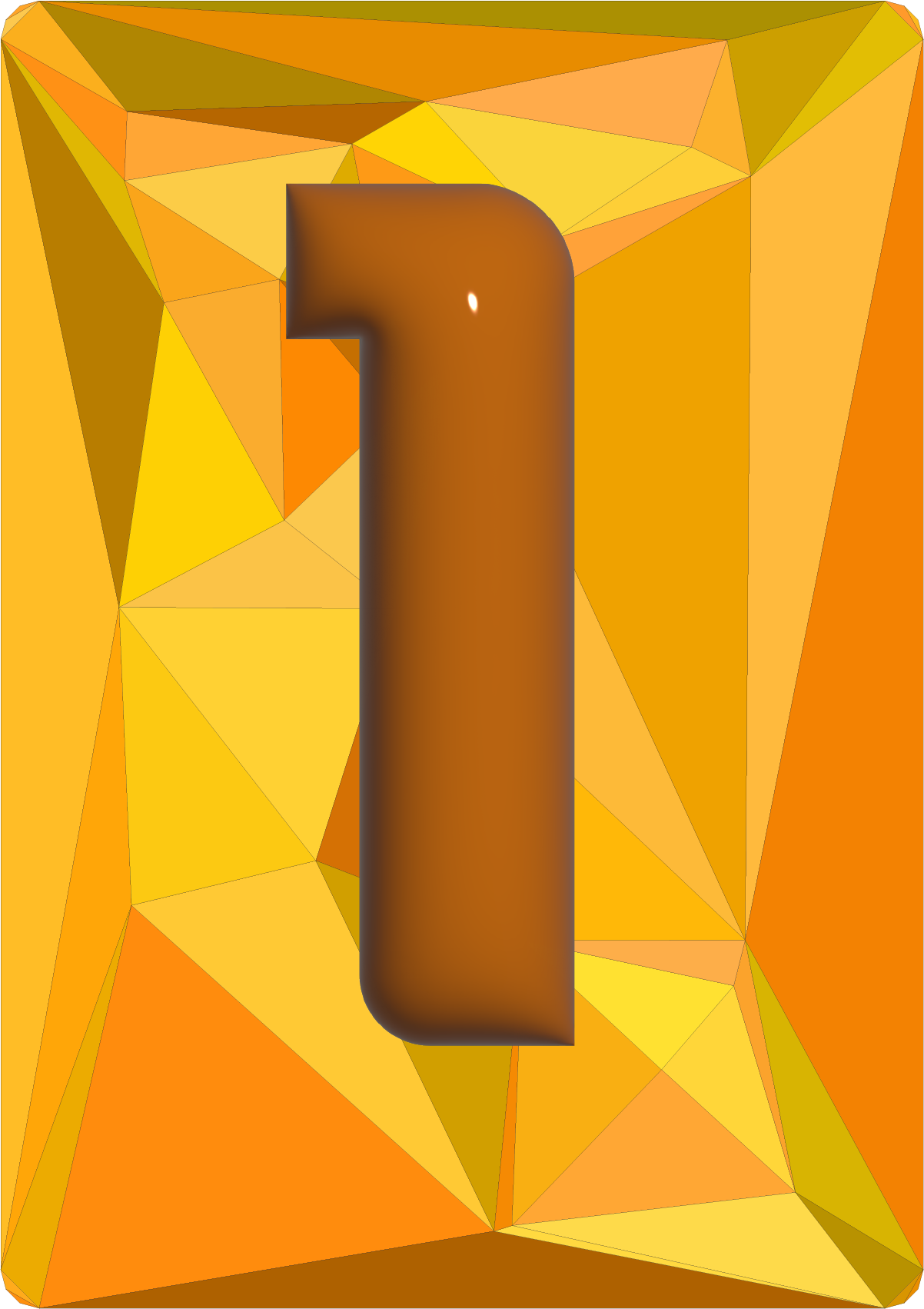
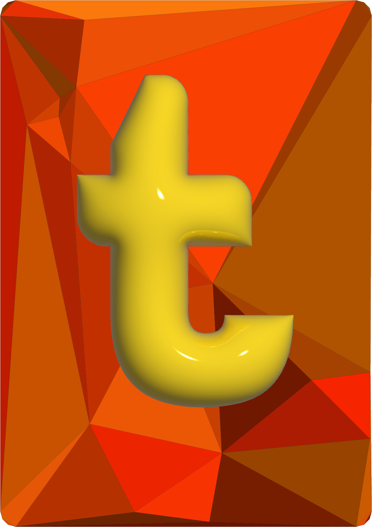
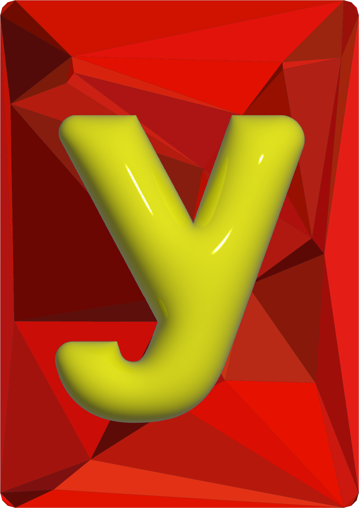
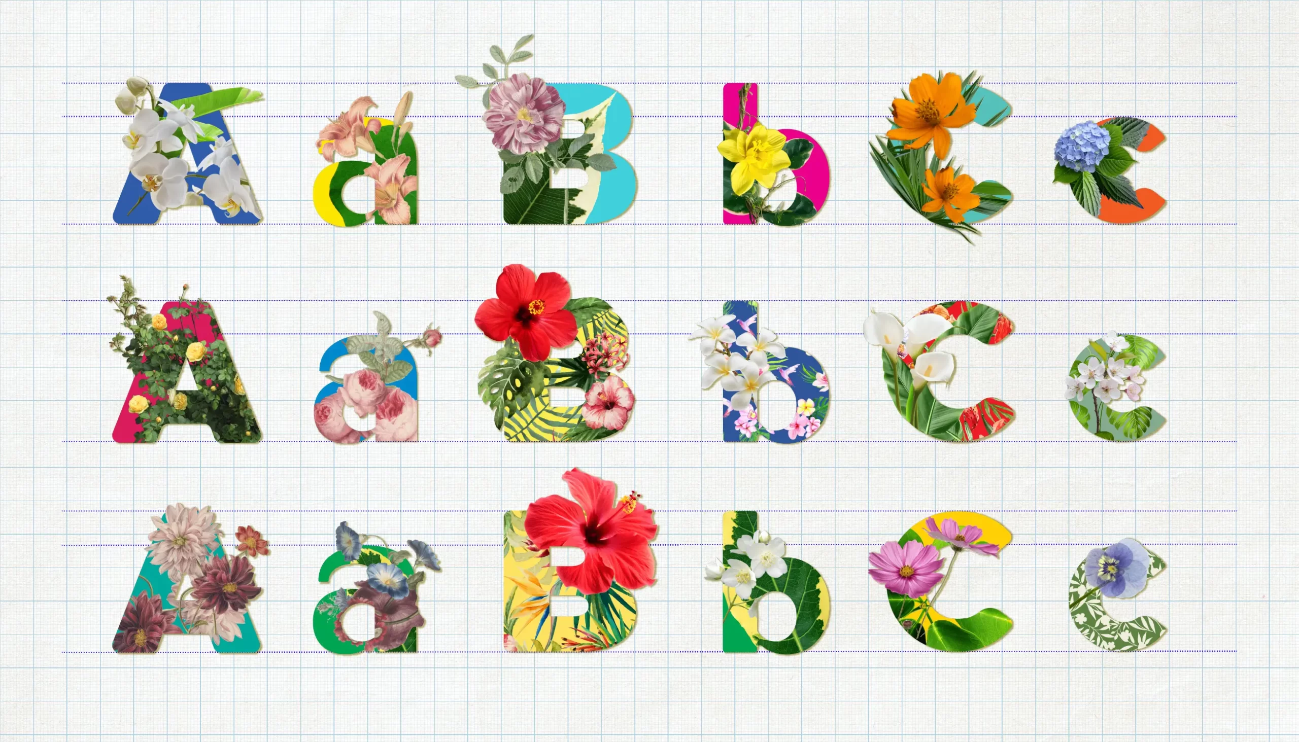
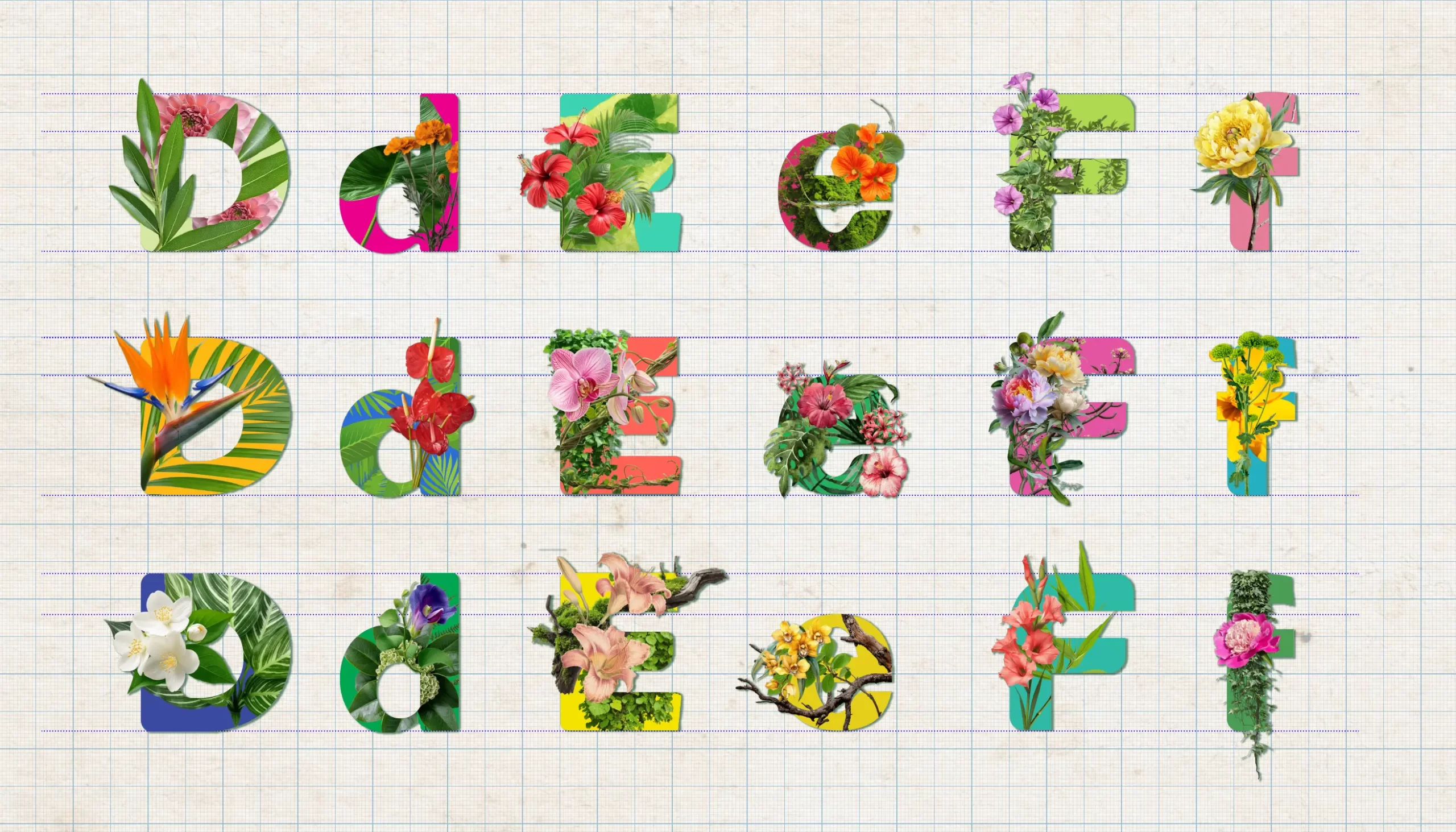
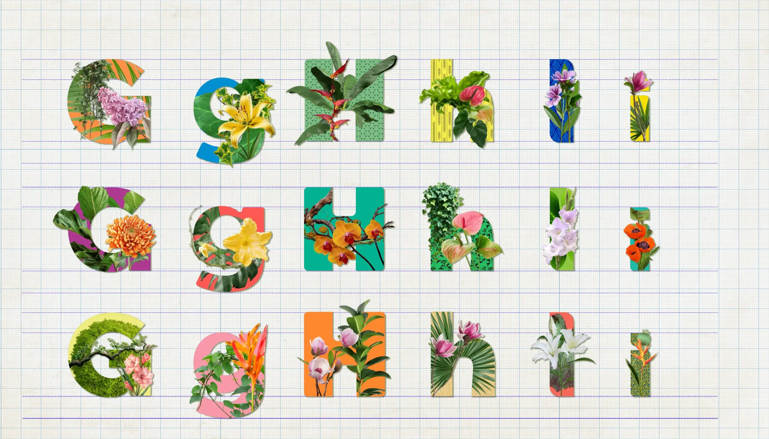
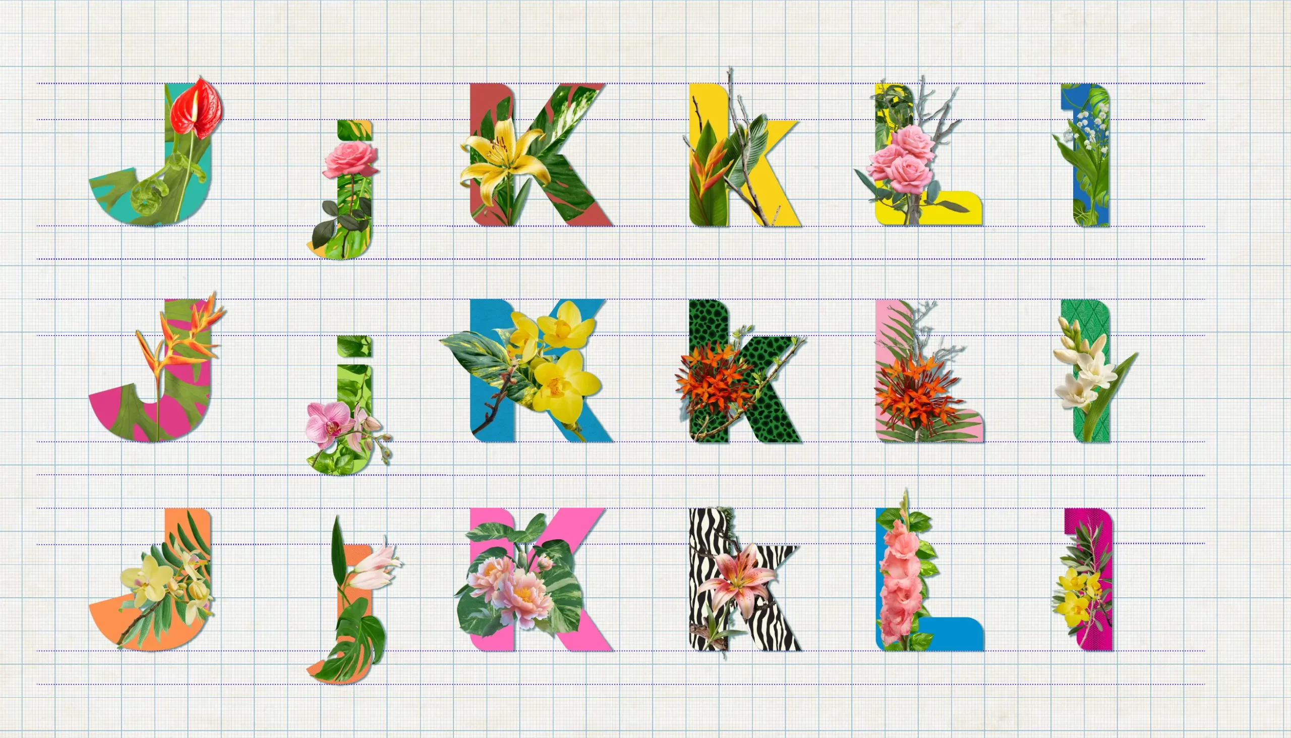
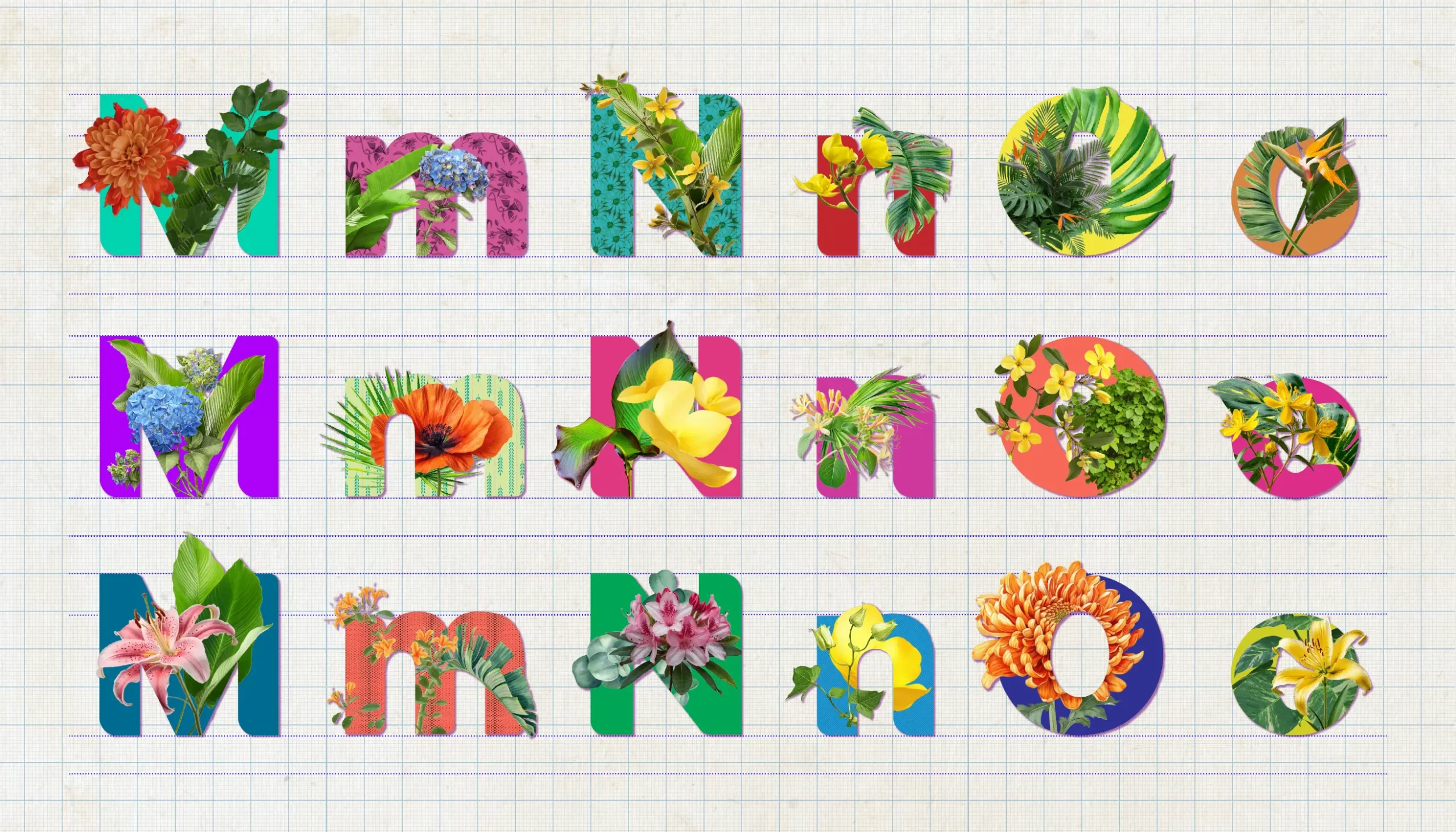
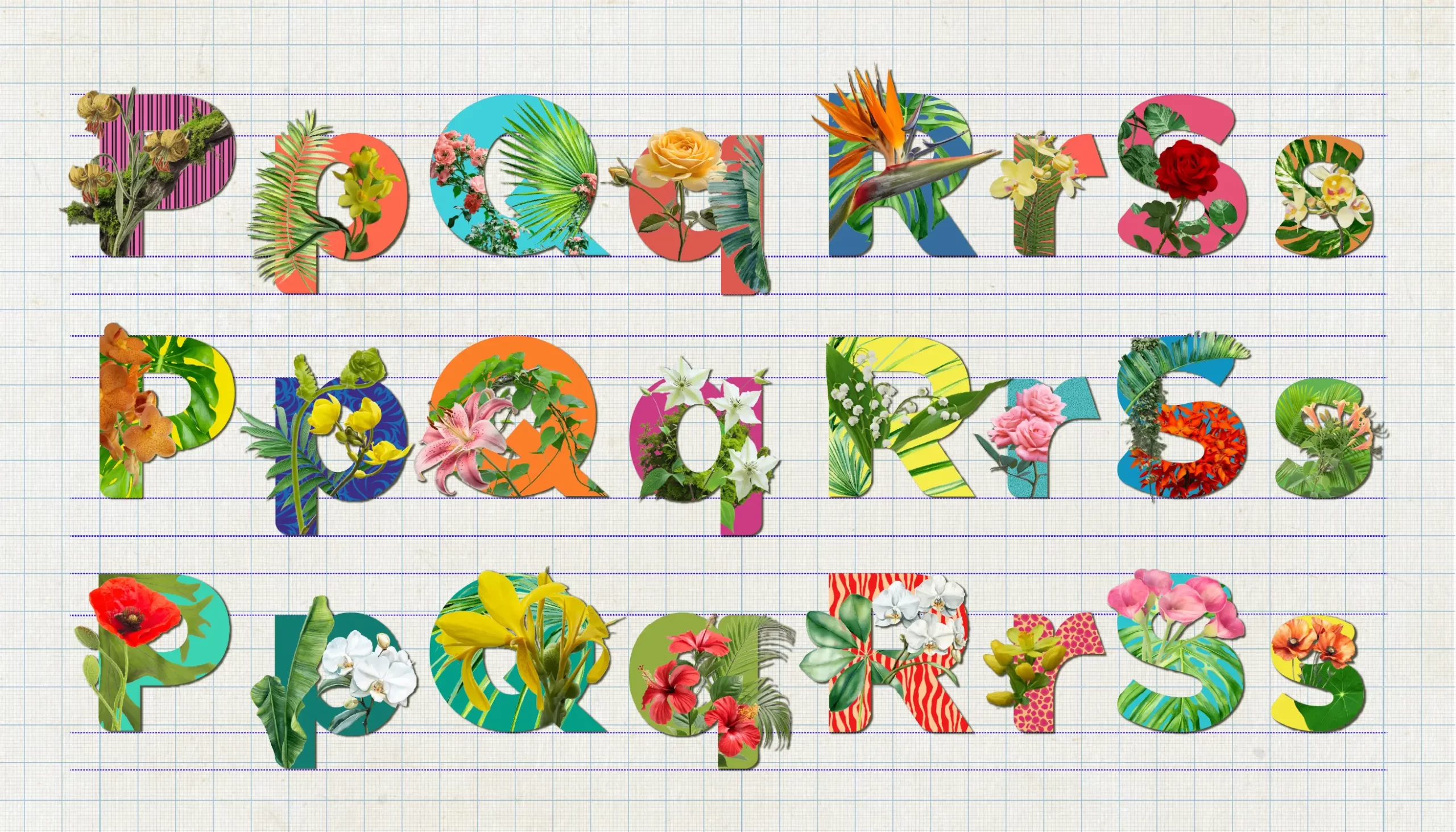
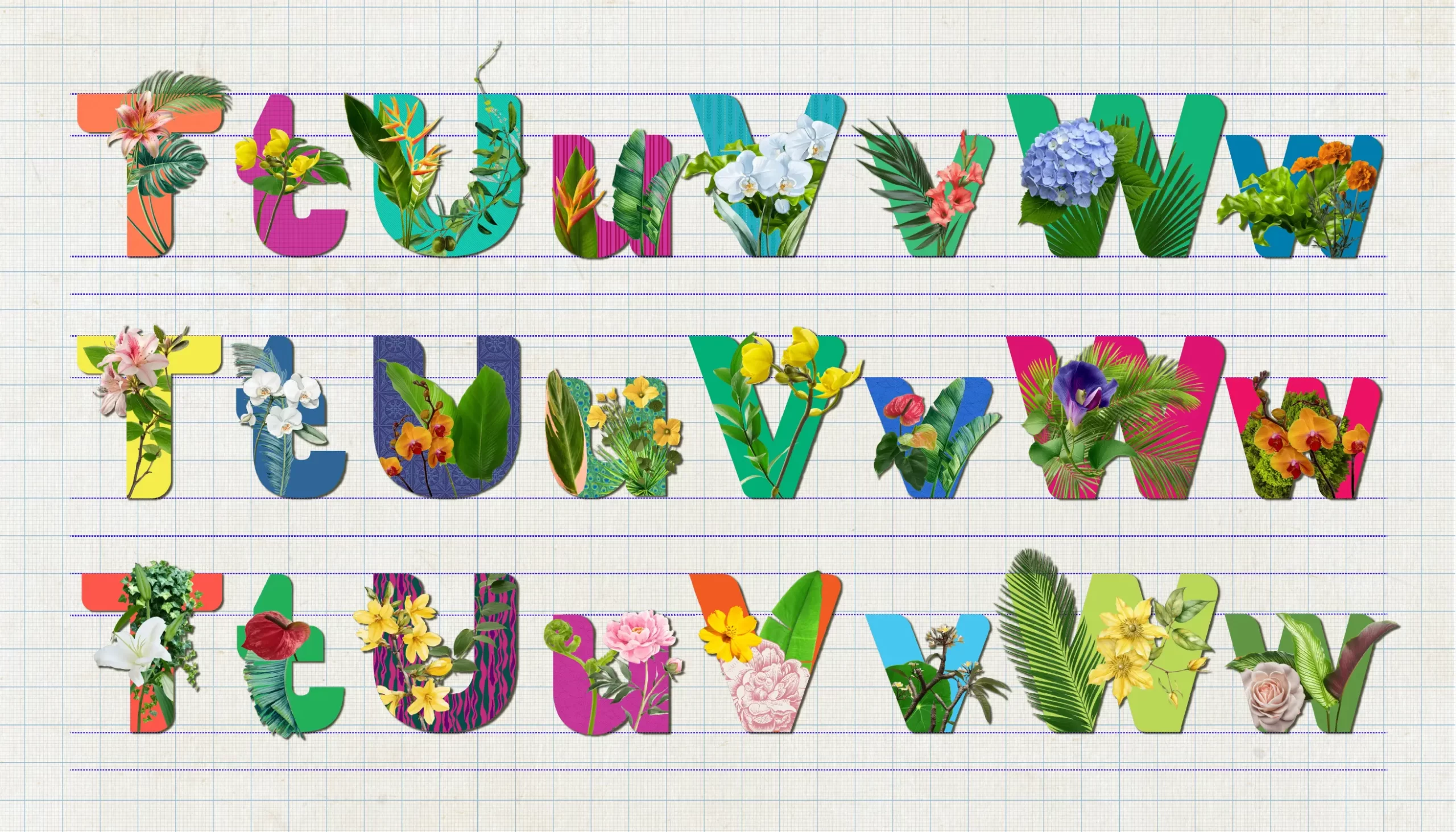
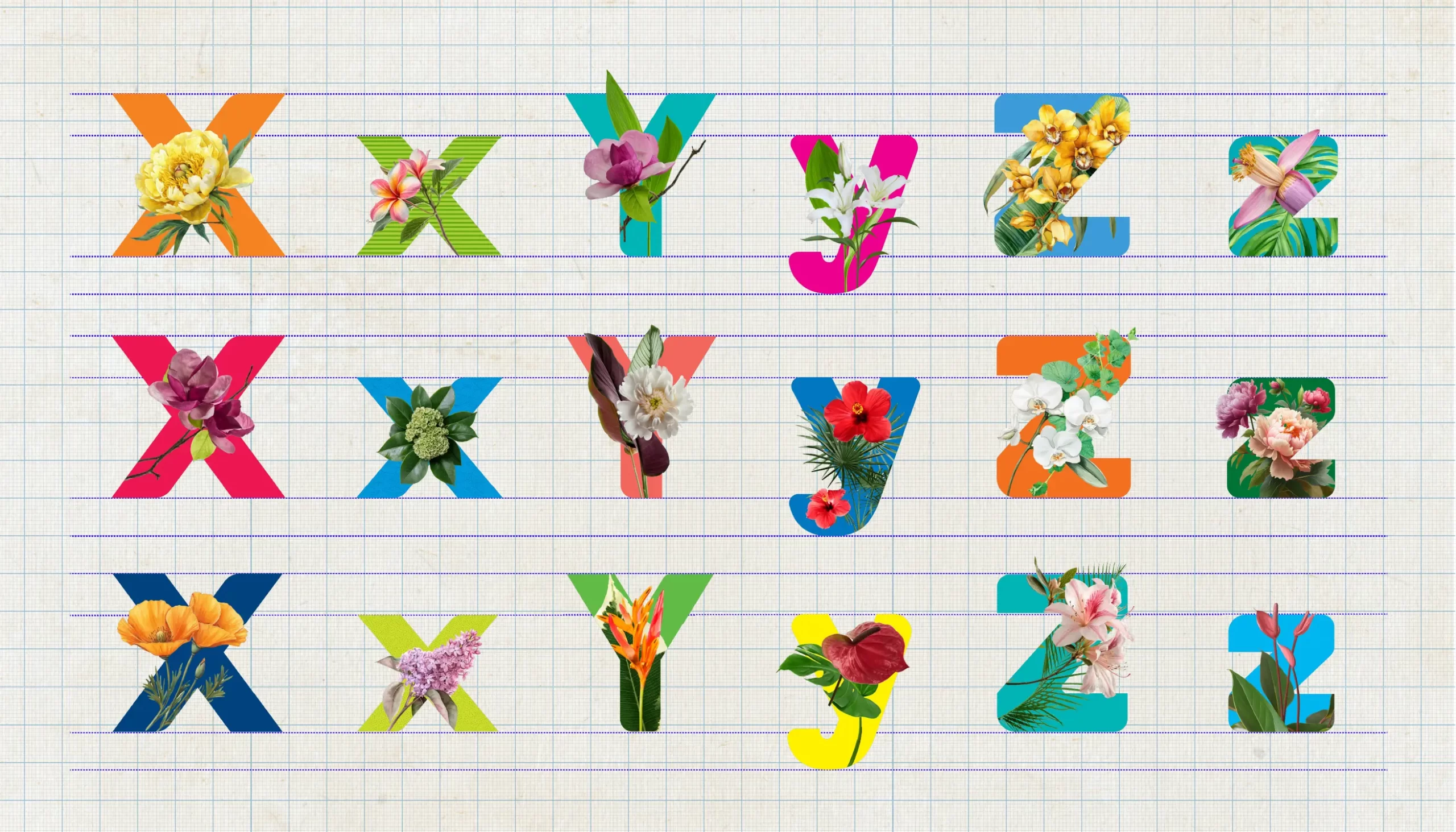
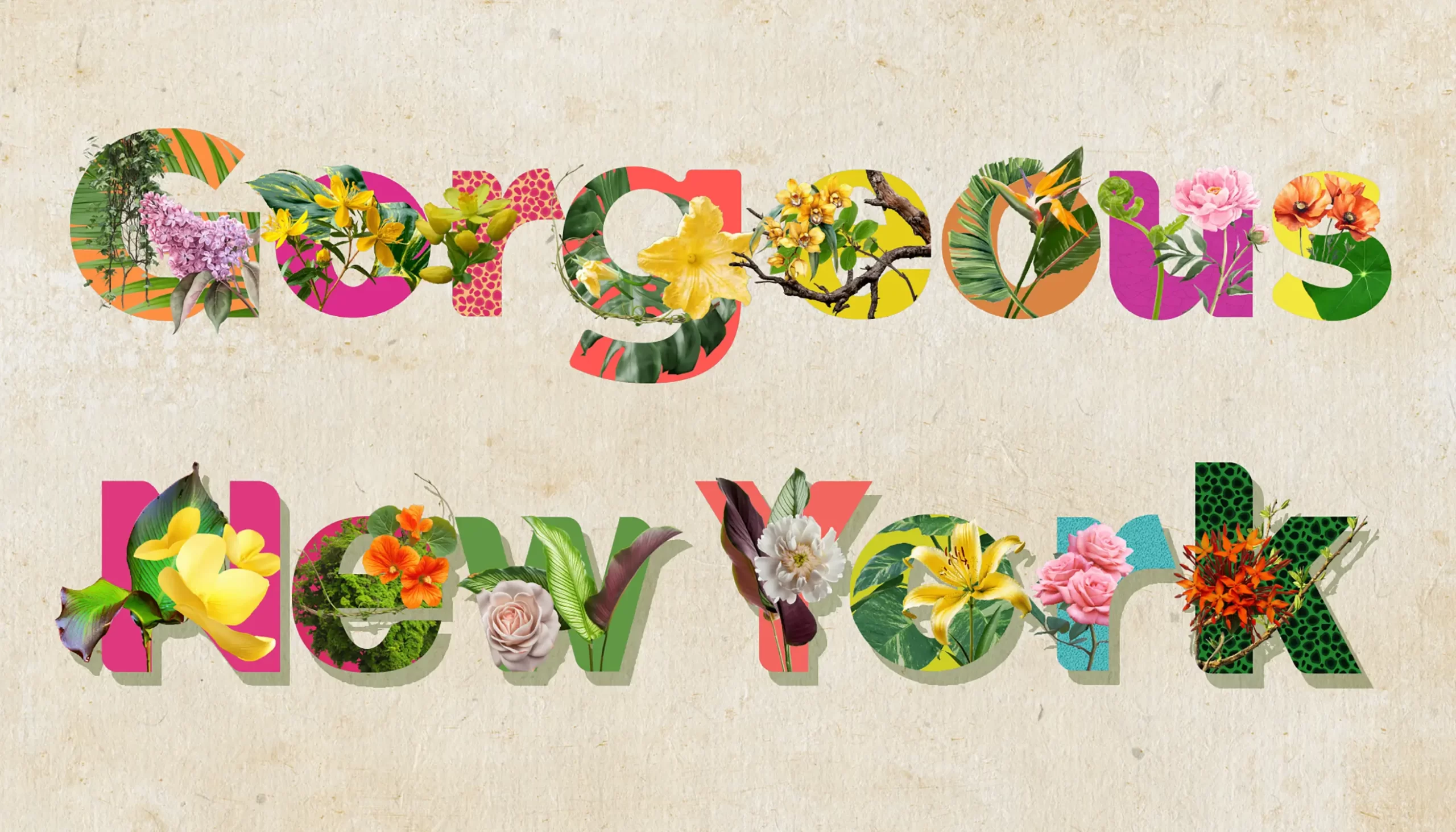
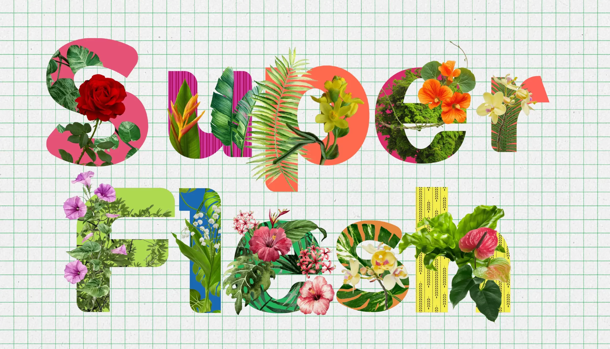
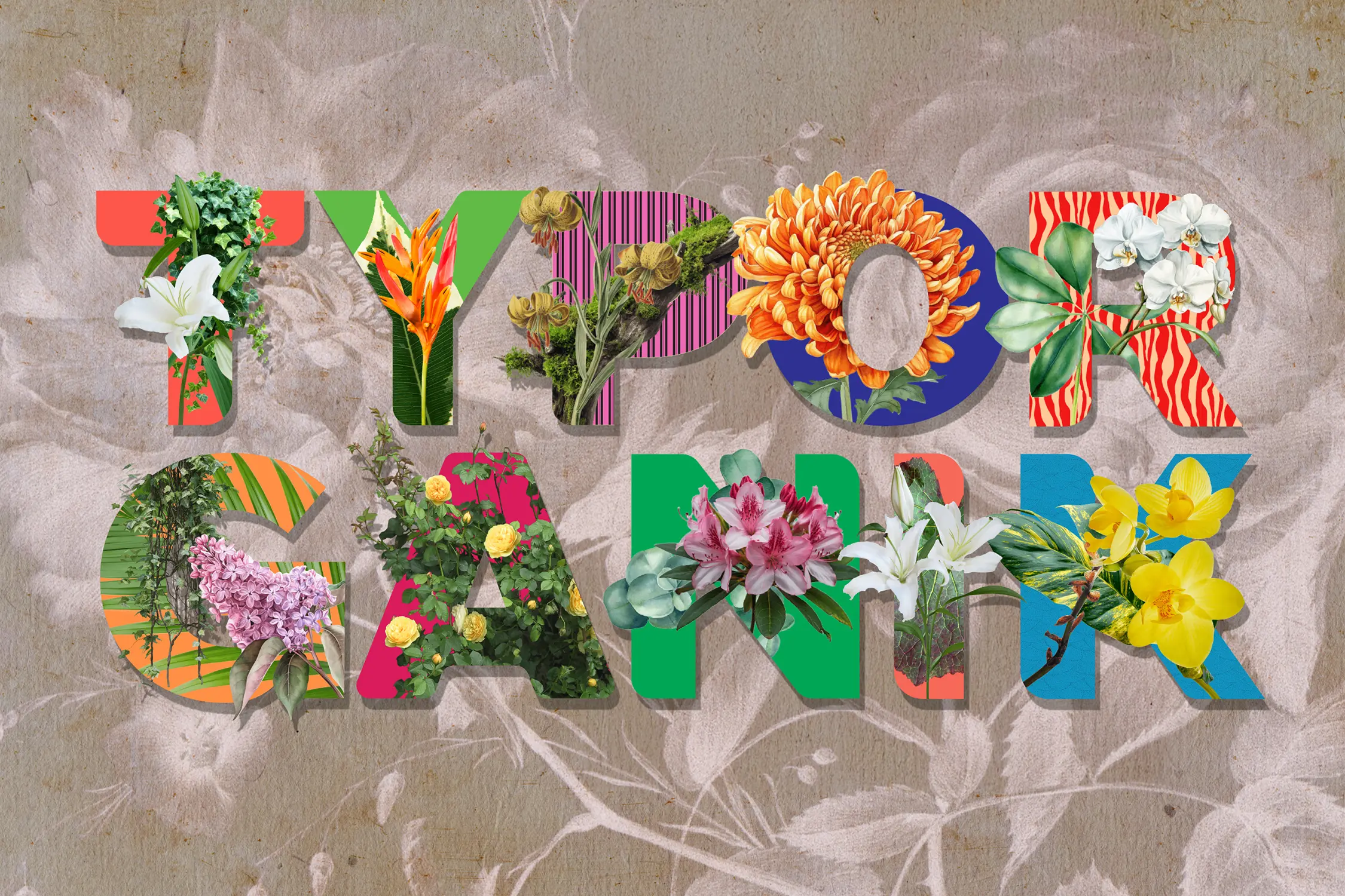
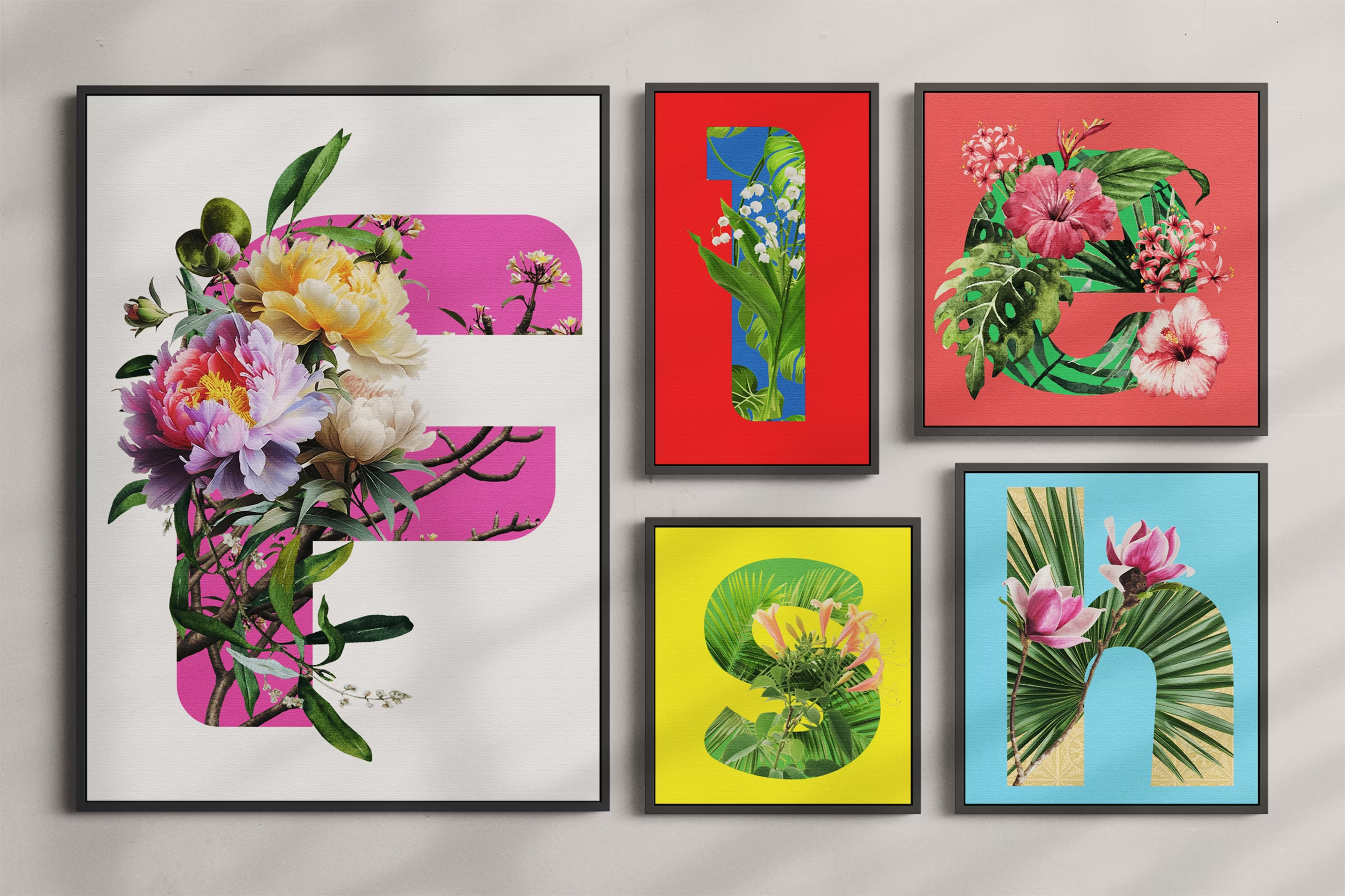
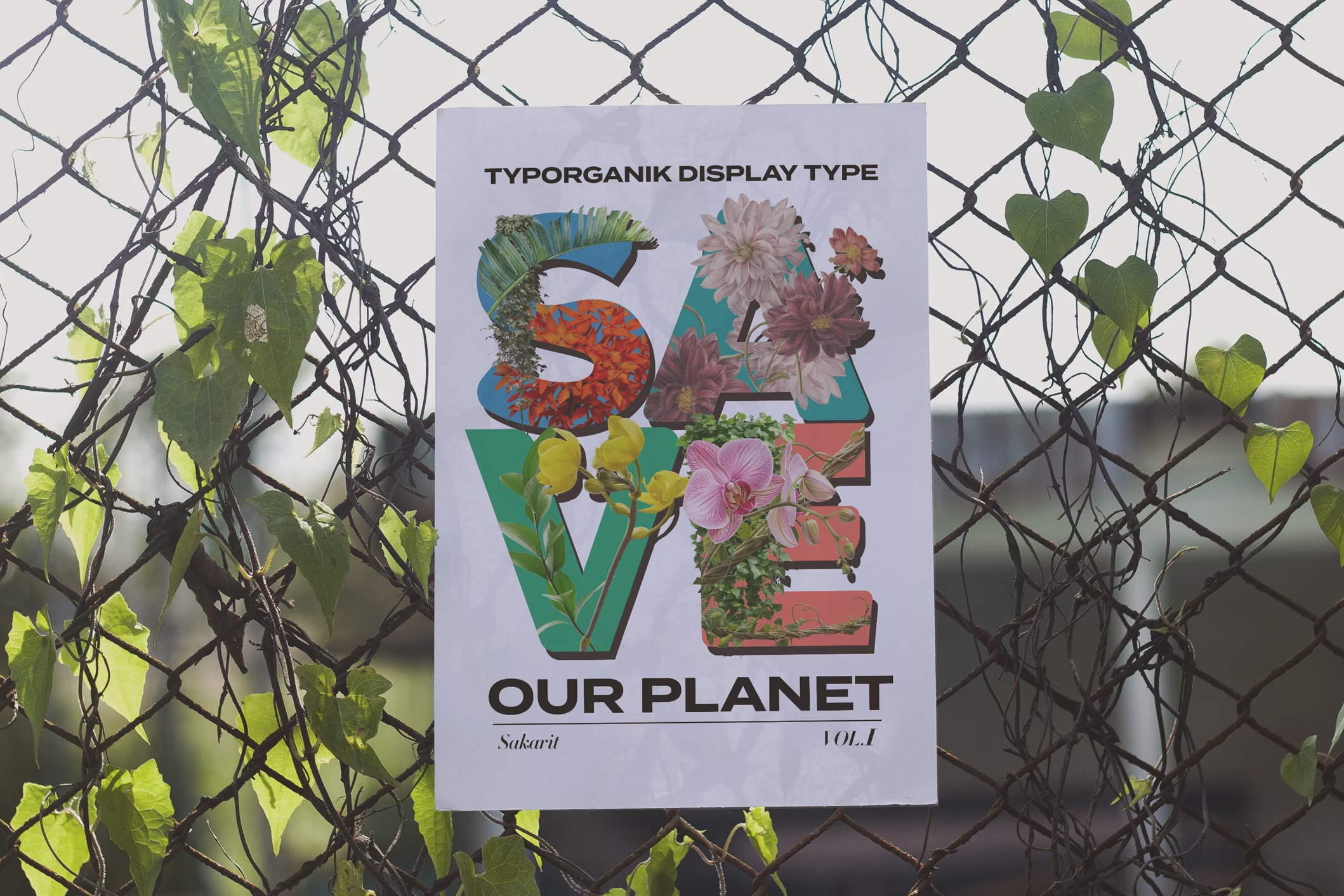
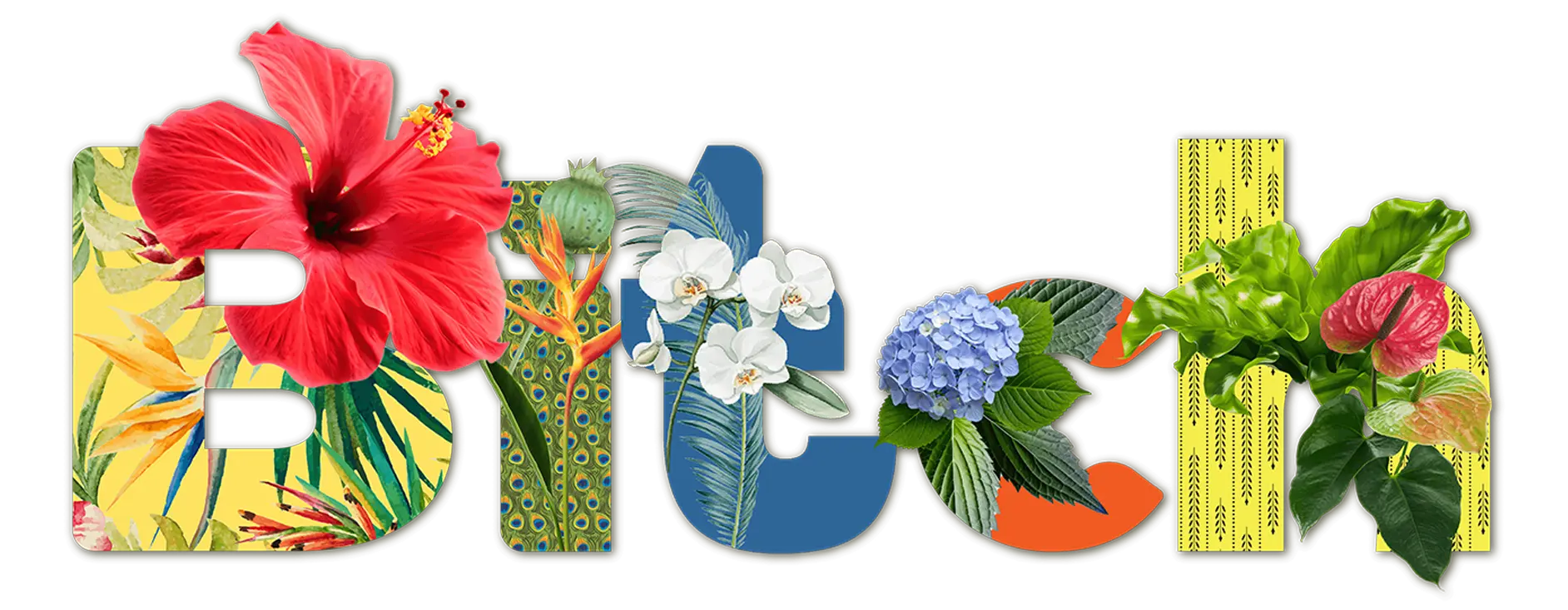
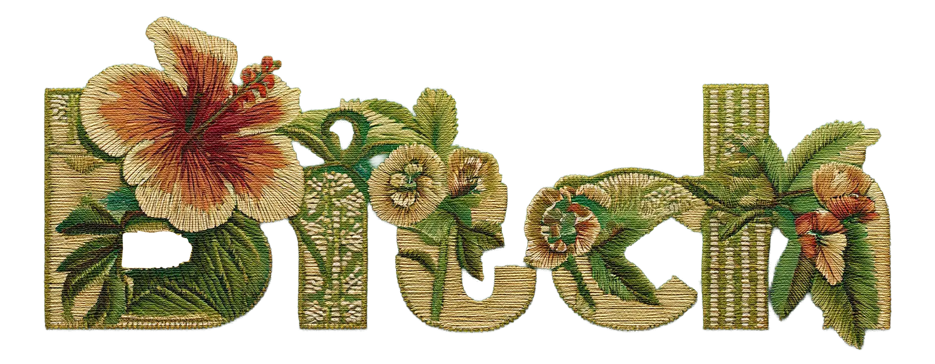
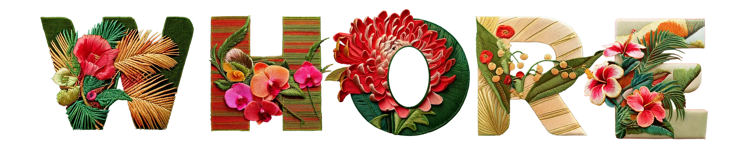
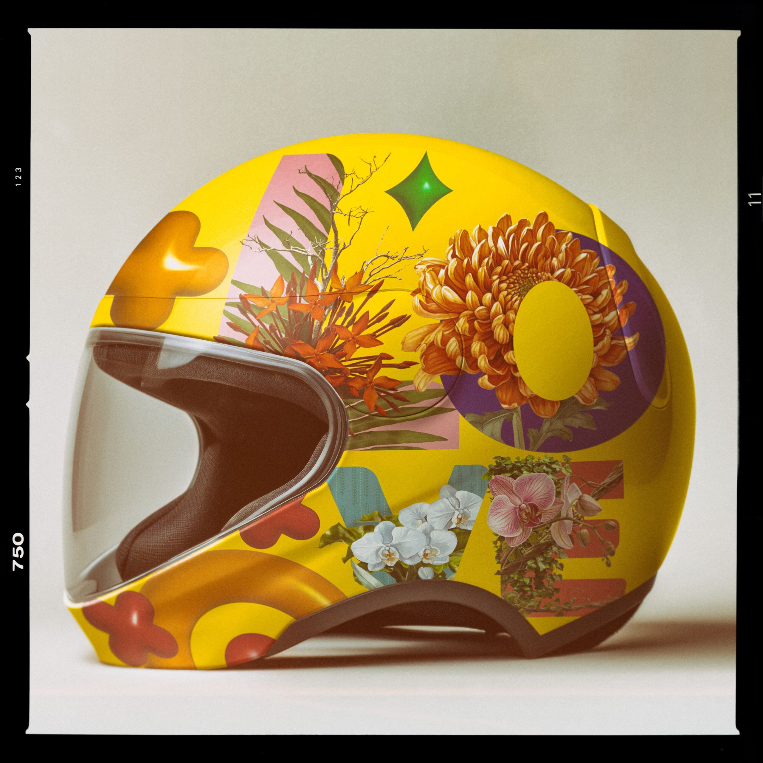
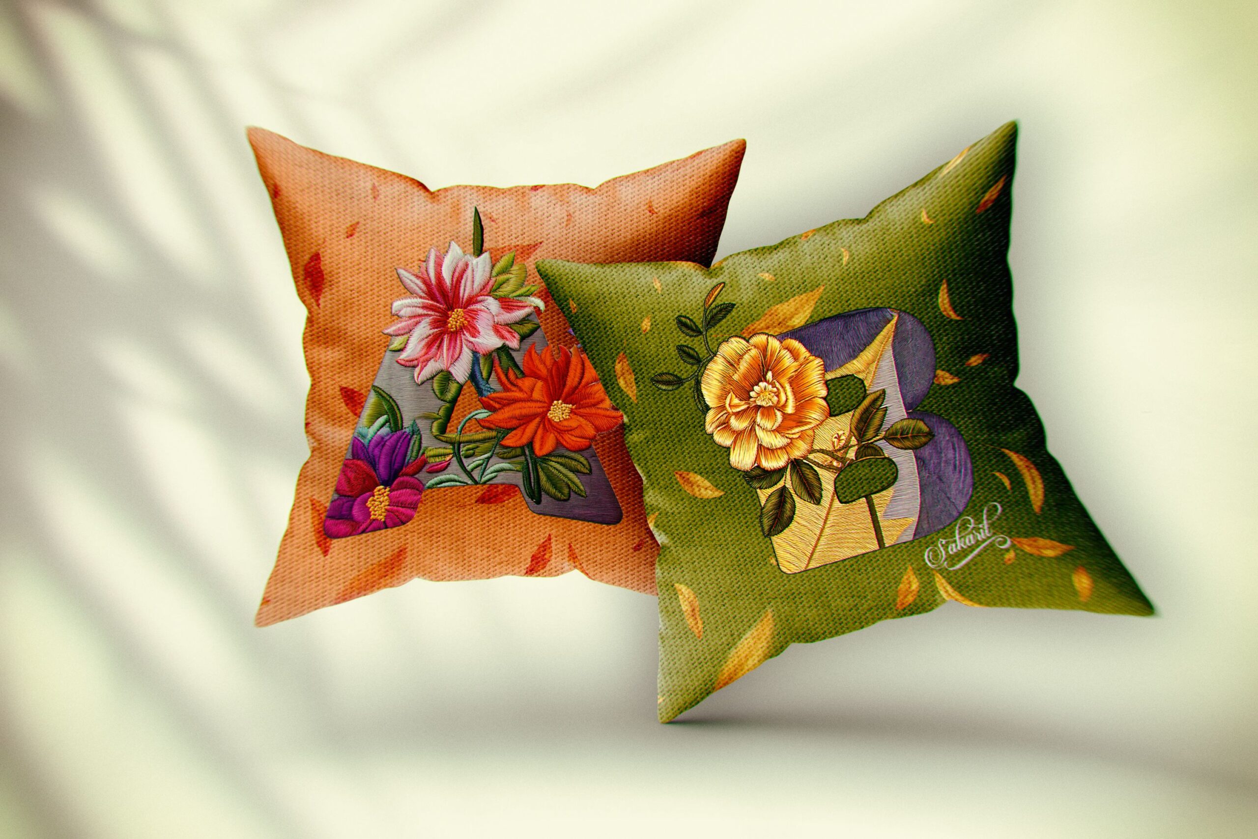
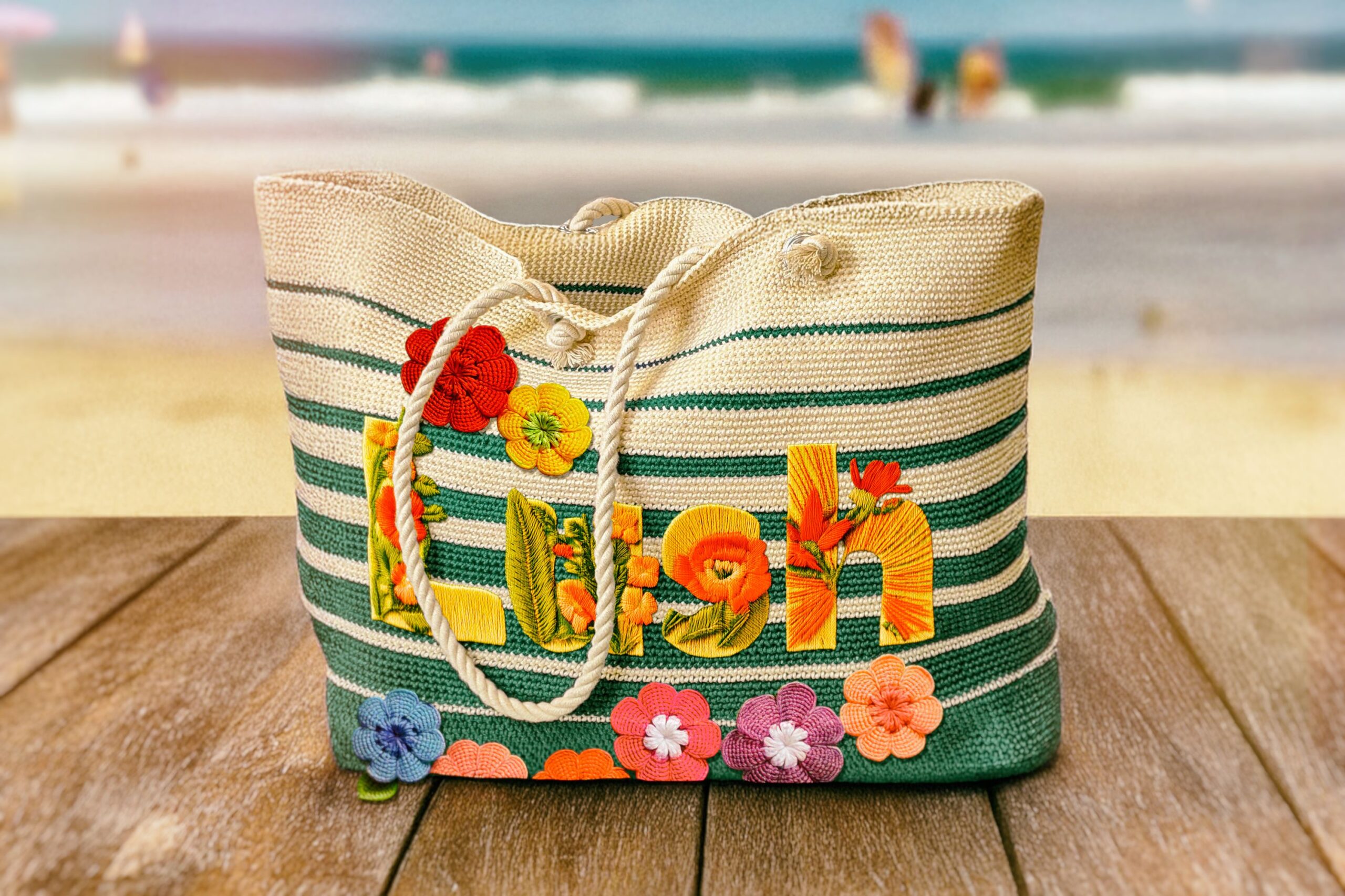
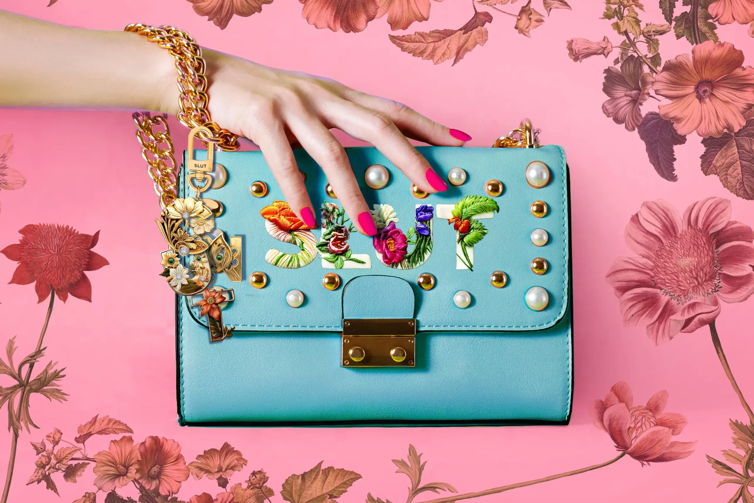
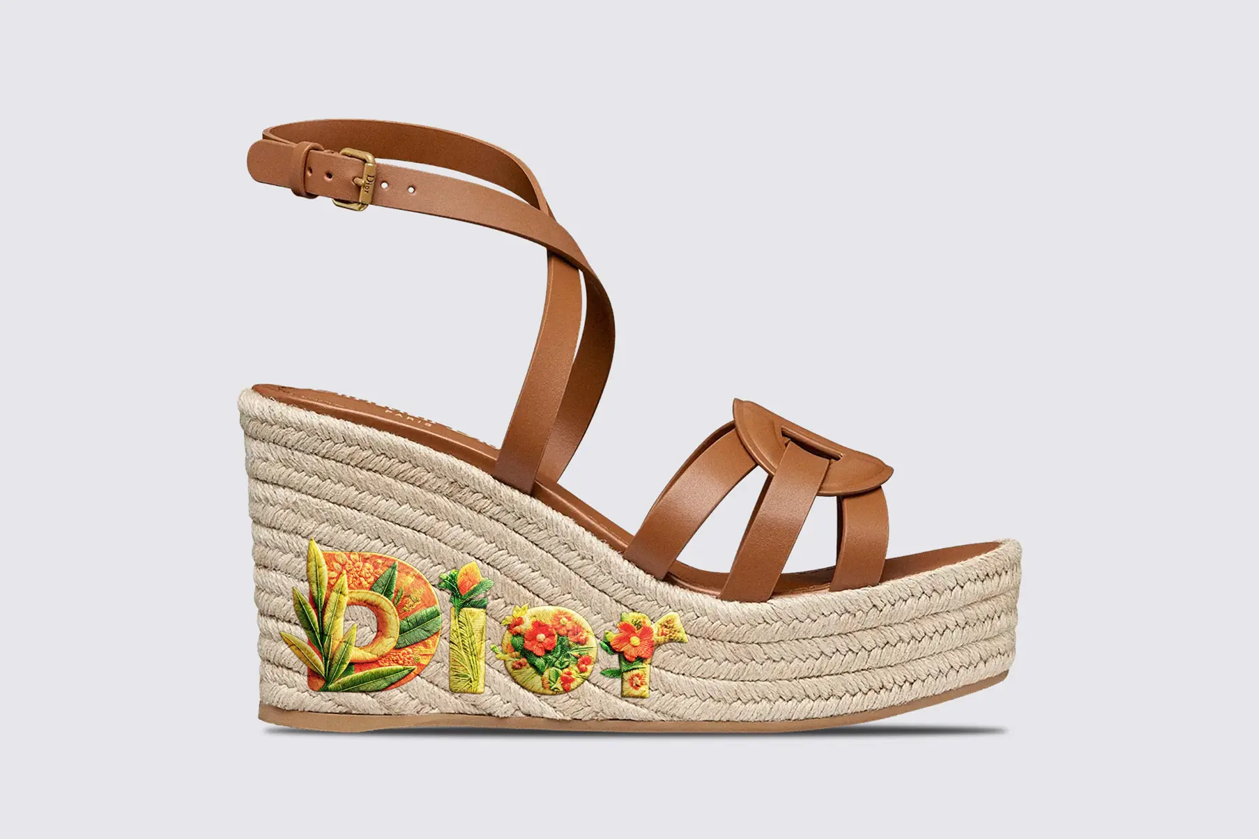
Typorganik Display is a sans-serif alphabet in full bloom, a collection of letterforms where nature refuses containment. Each letter flirts with illusion, employing Trompe-l’œil techniques that allow vines, petals, moss, and tendrils to erupt from the edges of the form, spilling beyond typographic convention. Organic structures entwine with deliberate design, creating a friction between geometry and growth.

Creative Brief

Objective:

  • Explore the intersection of typography and nature through illusion and texture
  • Challenge conventional letterform containment with expressive, blooming compositions
  • Showcase the potential of type as both functional and sculptural
  • Set the foundation for future similar series using isolated organic assets

Key Features:

  • 156 total glyphs (3 uppercase + 3 lowercase variations per letter)
  • Trompe-l’œil effects with layered imagery of flowers, ivy, vines, and leaves
  • Carefully curated botanical images, each meticulously integrated through intensive Photoshop work
  • Display font intended for visual impact and creative installations

Target Audience:

  • Designers and art directors seeking experimental, high-impact typography
  • Cultural institutions and publications interested in surreal, narrative-driven type
  • Creatives exploring nature-inspired visual identity systems
  • Type collectors, educators, and curators of avant-garde design

Approach

Image Curation:

  • Hundreds of found botanical photos (flowers, branches, leaves, vines) were gathered with attention to texture, mood, and shape.
  • Every image was selected for its unique visual rhythm and potential to integrate naturally with letterforms.

Layering Technique:

  • Each of the 156 glyphs was individually constructed in Photoshop, often requiring dozens of carefully masked and retouched layers.
  • Organic elements were scaled, contoured, and color-corrected to seamlessly blend with typographic anatomy while retaining visual autonomy.

Trompe-l’œil Strategy:

  • Compositions, depth, and perspective were manipulated to create believable illusions of growth spilling beyond the font’s silhouette.
  • The result is an interplay between dimensional realism and graphic abstraction.

Labor-Intensive Craftsmanship:

  • Every letter was treated as a standalone sculpture, demanding precision, patience, and intuitive design decisions. It was typographic cultivation.

Results

  • Created 156 unique display fonts (3 variations per A–Z upper and lowercase)
  • Pushed boundaries of typographic structure using botanical photo integration
  • Achieved Trompe-l’œil effects that blur the line between type and nature
  • Elevated type design as both expressive form and conceptual storytelling
  • Built a foundation for future series use of removal organic elements
  • Sparked interest from multidisciplinary audiences (graphic designers, curators, and educators)
  • Strengthened portfolio with a visually and conceptually distinctive showcase
  • Demonstrated technical expertise in image manipulation and typographic layout
  • Offered potential for broader applications such as branding, editorial, and exhibition
Tools & skills

With three floral and trompe-l'œil-inspired variations of both uppercase and lowercase letters, this display font explores multiplicity not as excess, but as storytelling. The result is a riotous choreography of form and movement, where structure meets sculpture, and organic elements come alive.

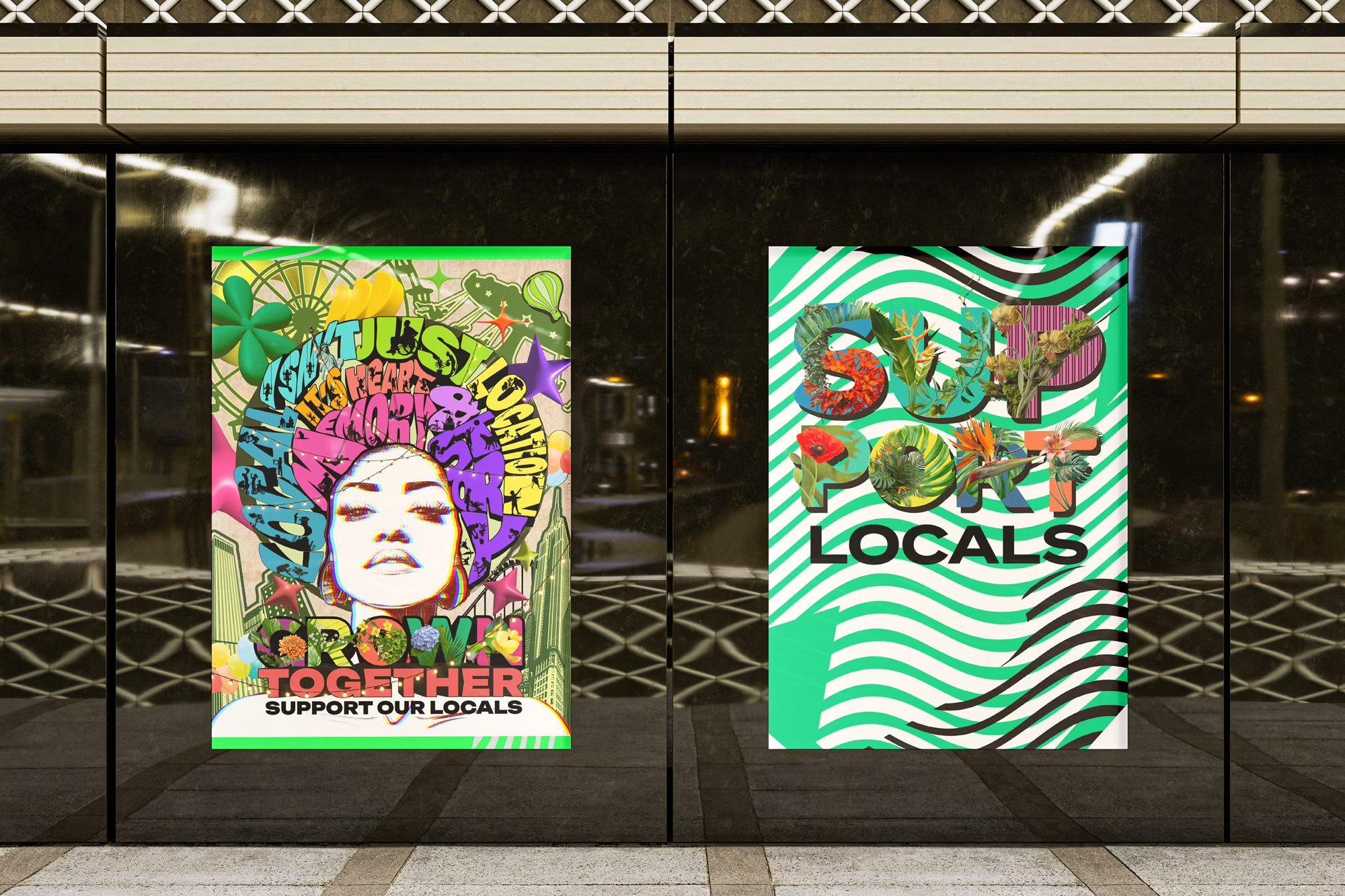
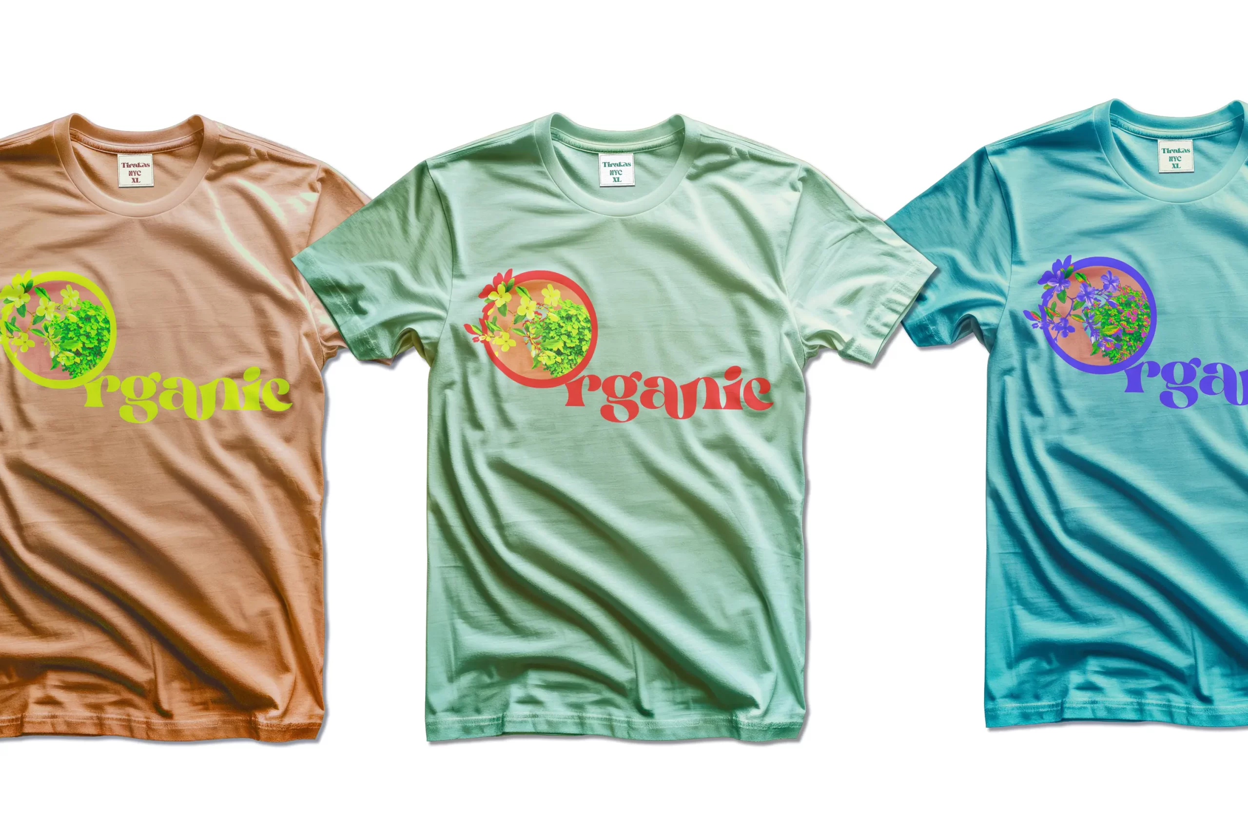
Though this "Typorganik Display" currently focuses on expressive letterforms without punctuation, symbols, numerals, or the Latin accents. its visual richness and sculptural detail make it ideal for industrial and lifestyle applications. From bags and tees to shoes, hoodies, pillowcases, and more each glyph becomes a wearable artwork, transforming everyday objects into environmentalism vibes, nature-infused statements.

Industrial design featuring Typorganik Display typeface; the composition blends high-contrast themes—vulgarity and natural beauty—through Trompe-l'œil botanical elements layered over reclaimed profane language. The piece reflects cultural confrontation, where activists and artists reframe offensive words into symbols of empowerment and expressive resistance.

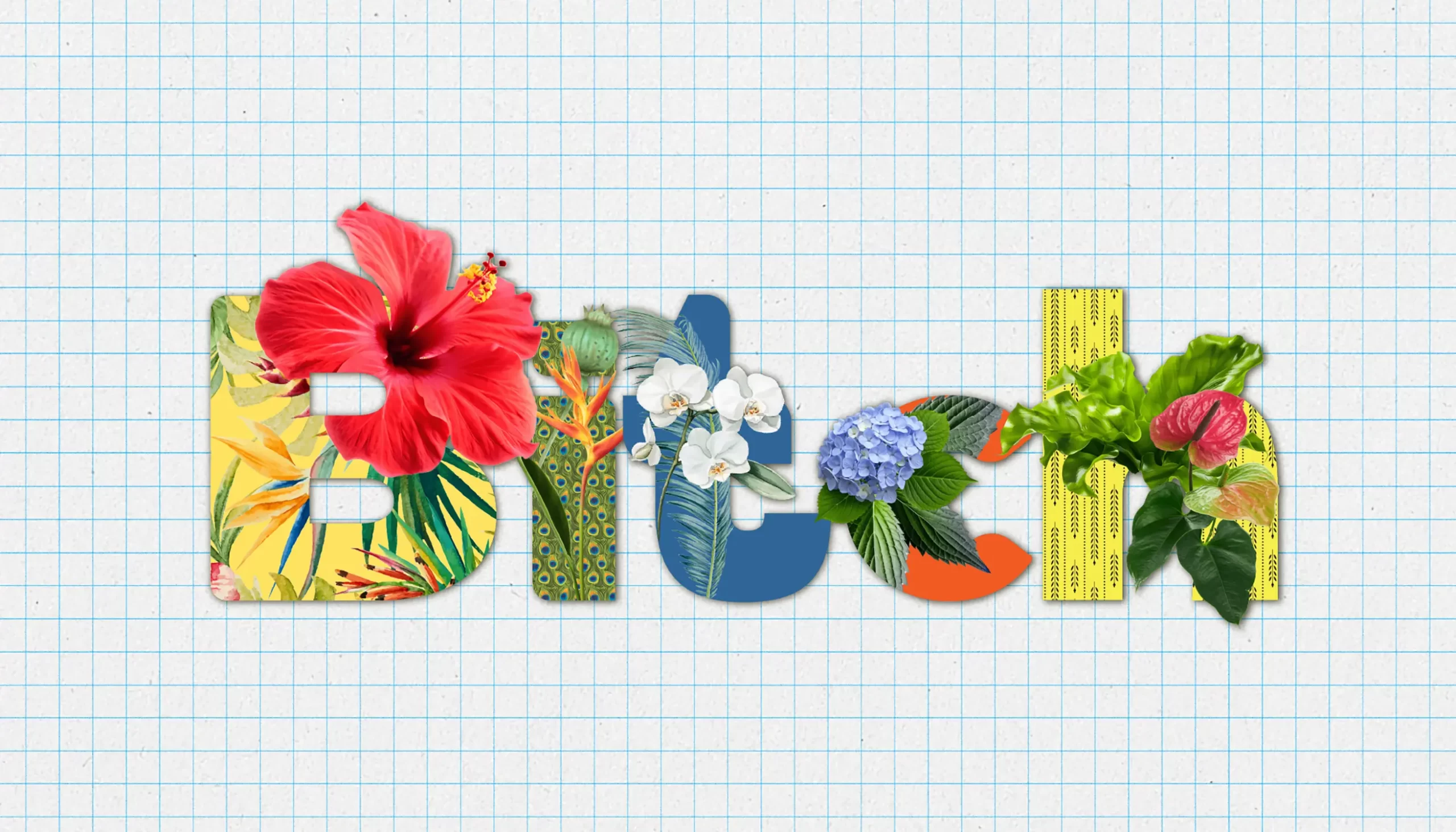
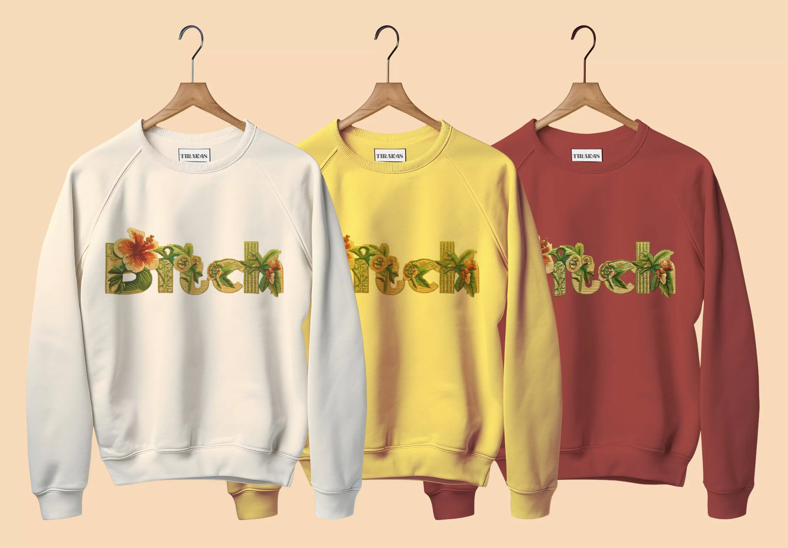
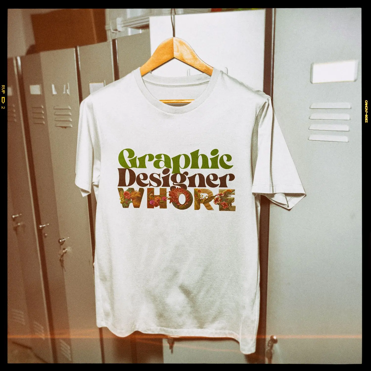
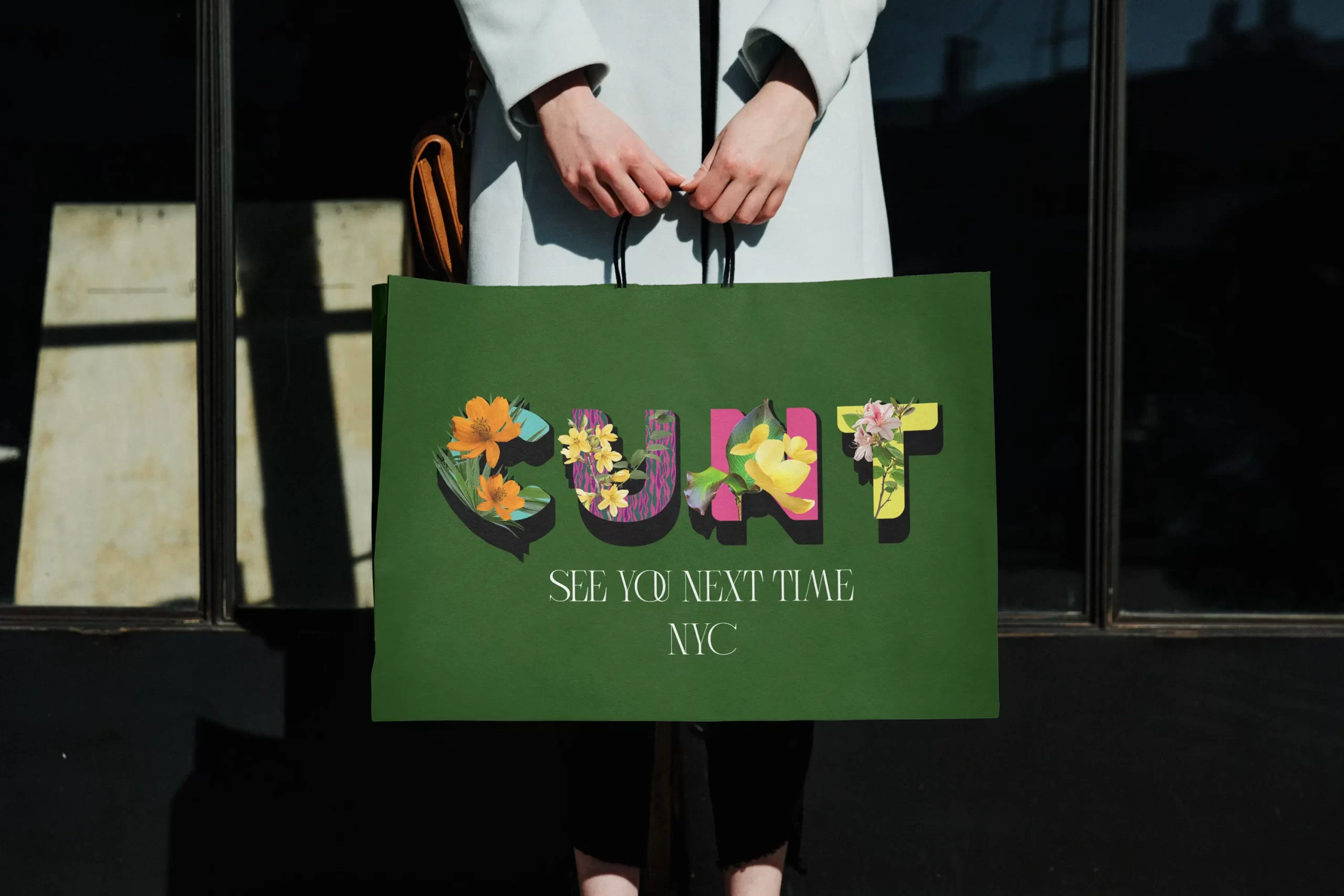
These designs featuring Typorganik Display typeface; the composition blends high-contrast themes (vulgarity and natural beauty) through Trompe-l’œil botanical elements layered over reclaimed profane language. The piece reflects cultural confrontation, where numerous activists and artists have reframed offensive words into symbols of empowerment and expressive resistance. 

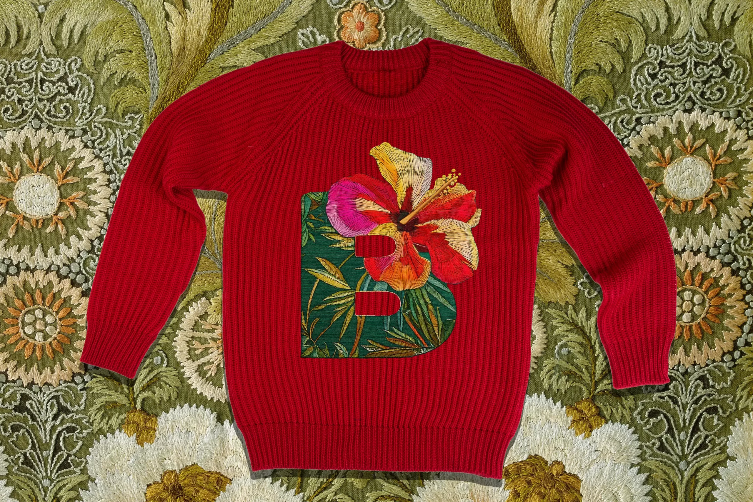
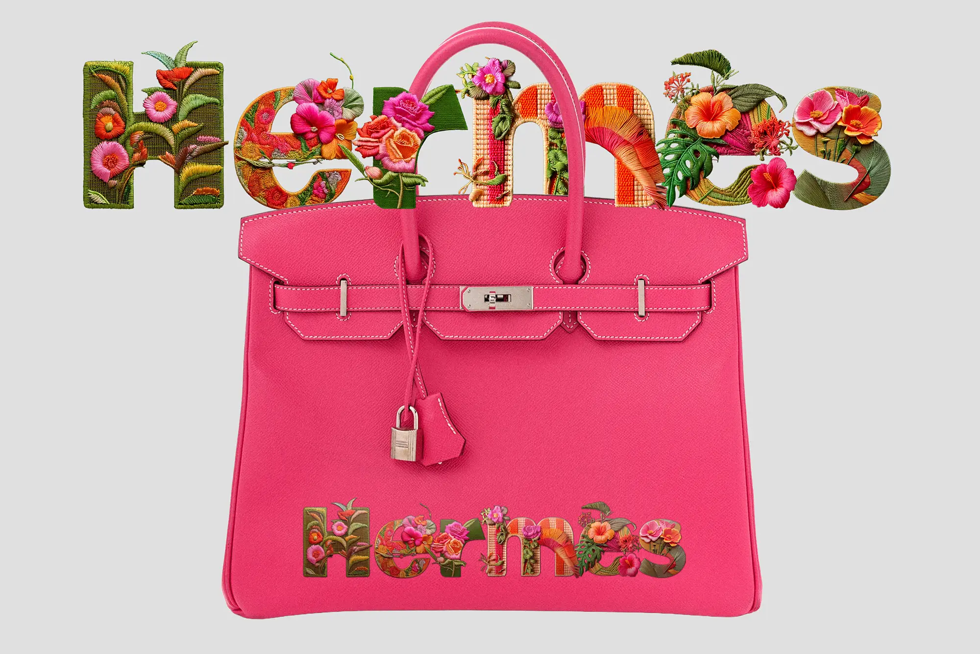
The mockups use Adobe Firefly to visualize my typeface in an embroidered Chinoiserie style. Several fashion houses have already incorporated intricate, hand-sewn Chinoiserie into their couture collections, and with today’s technology, this level of craftsmanship is more accessible than ever. By merging digital innovation with traditional aesthetics, the design not only holds commercial potential but also elevates the typeface into a new realm of artisanal expression.

Vulgarity++
++Sublimity

This clutch was designed to integrate with my custom floral typeface, showcasing words that cross the fine line between vulgarity and high art, or haute couture. Through this piece, I explore how pervasive language can be recontextualized into a luxurious new meaning, transforming everyday expression into elevated visual form.

Floral Forms
in High Fashion

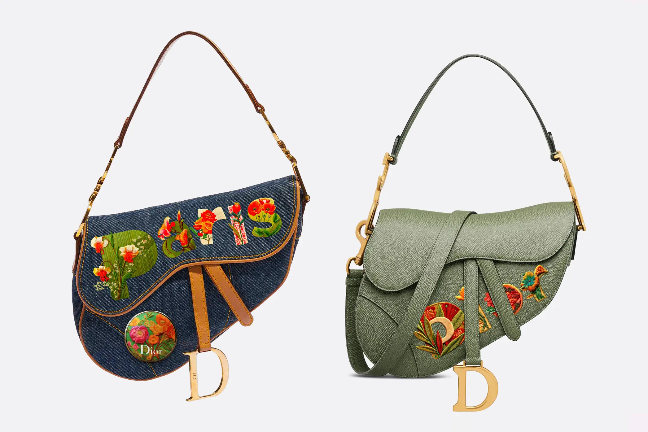
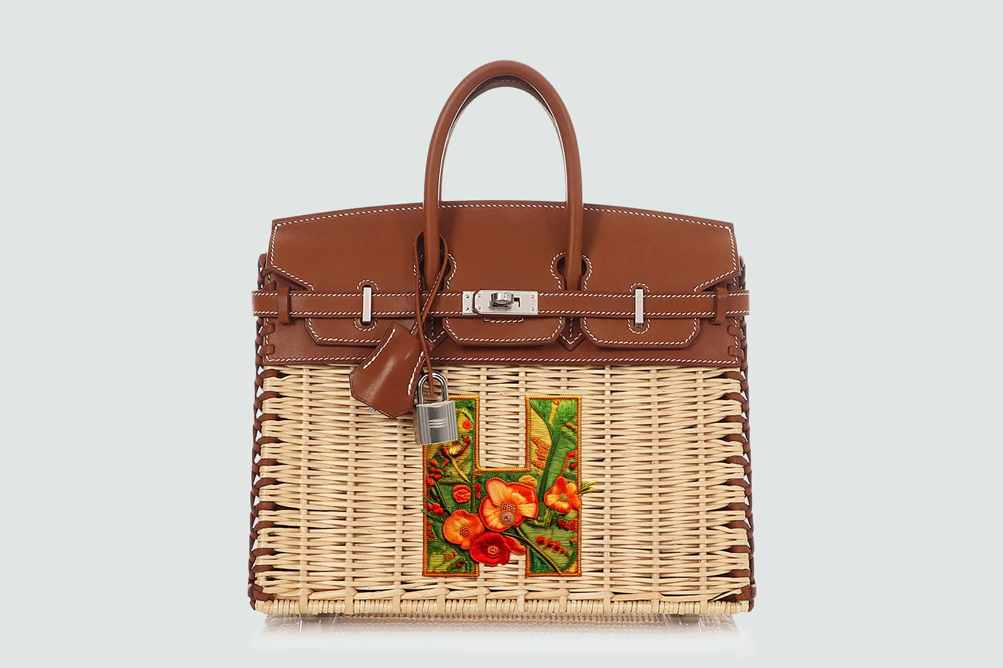
With its elaborate floral aesthetics, Typorganik Display lends itself to embroidery on luxury items such as Dior bags and sandals, Hermès Birkins, and other couture accessories.

The typeface’s sculptural detail and organic elegance make it a natural fit for high fashion, where craftsmanship and concept converge. As fashion houses embrace hand-sewn Chinoiserie and botanical motifs, Typorganik offers both commercial potential and a new direction for typographic artistry in couture.

Dior D-Club Wedge Sandal in Camel Calfskin, featuring Chinoiserie floral detailing and the word “Dior” embroidered in Typorganik Display typeface.
ior Saddle Bag with Strap in Cedar Green Grained Calfskin, featuring the word 'Dior' embroidered in Typorganik Display typeface with Trompe-l'œil Chinoiserie floral motifs. Dior Saddle Medium in Denim Blue with Strap, featuring the word 'Paris' embroidered in Typorganik Display typeface, pinned with with an enamel floral button that echoes the botanical embroidery.
Hermès Picnic Birkin 25 in Naturel Wicker and Fauve Barenia with Palladium Hardware, featuring Chinoiserie floral detailing and the letter “H” embroidered in Typorganik Display typeface.
Hermès Epsom Birkin 35 in Rose Tyrien, featuring the word 'Hermès' embroidered in Typorganik Display typeface; Trompe-l'œil Chinoiserie floral motifs—vines, blossoms, and layered botanical textures—integrate with the letterforms, blending luxury craftsmanship with organic typography.
0:00
0:00