


Sakarit is a Graphic Designer & Visual Artist, based in Brooklyn, NYC
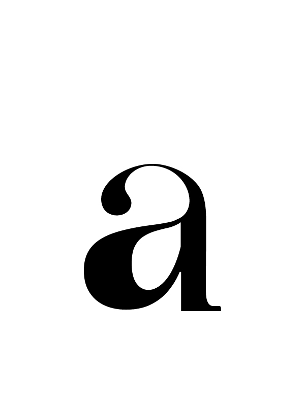
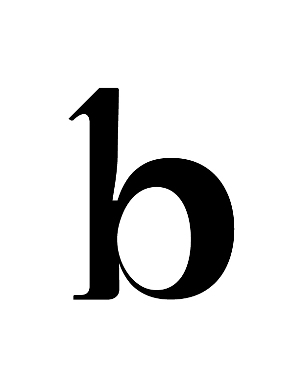
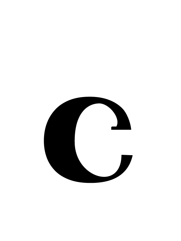
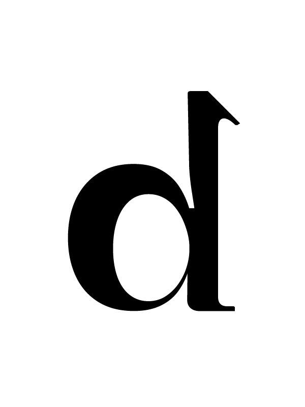
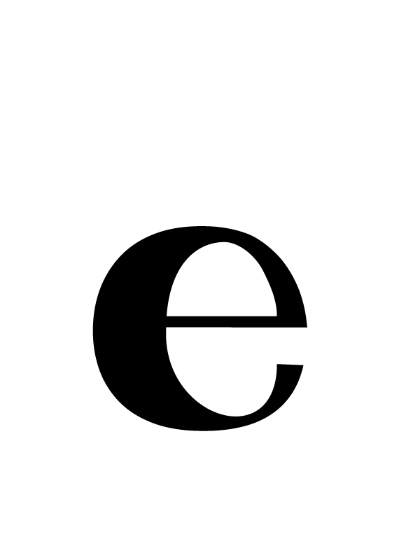
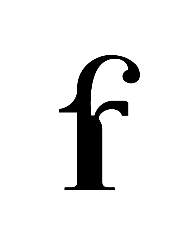
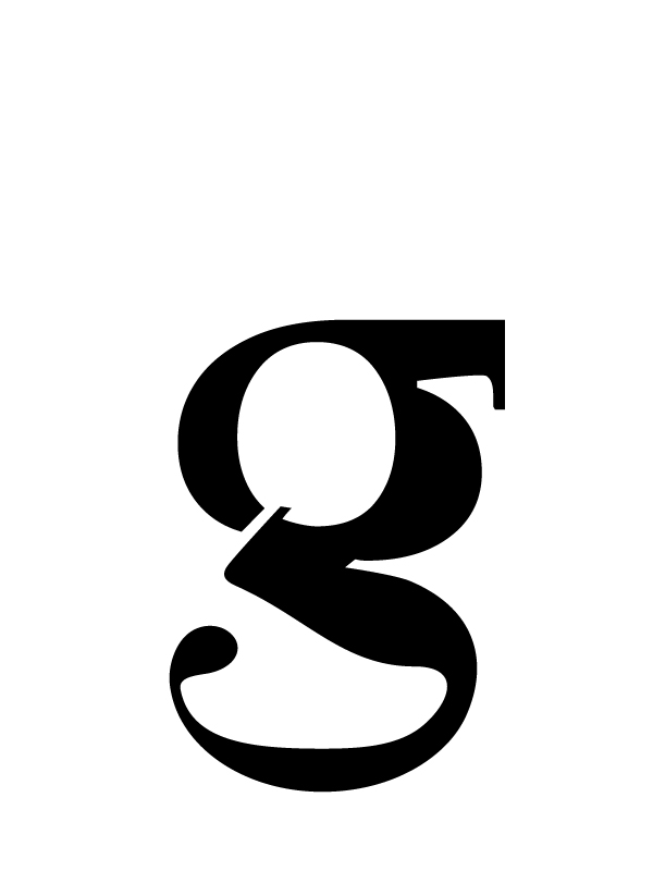
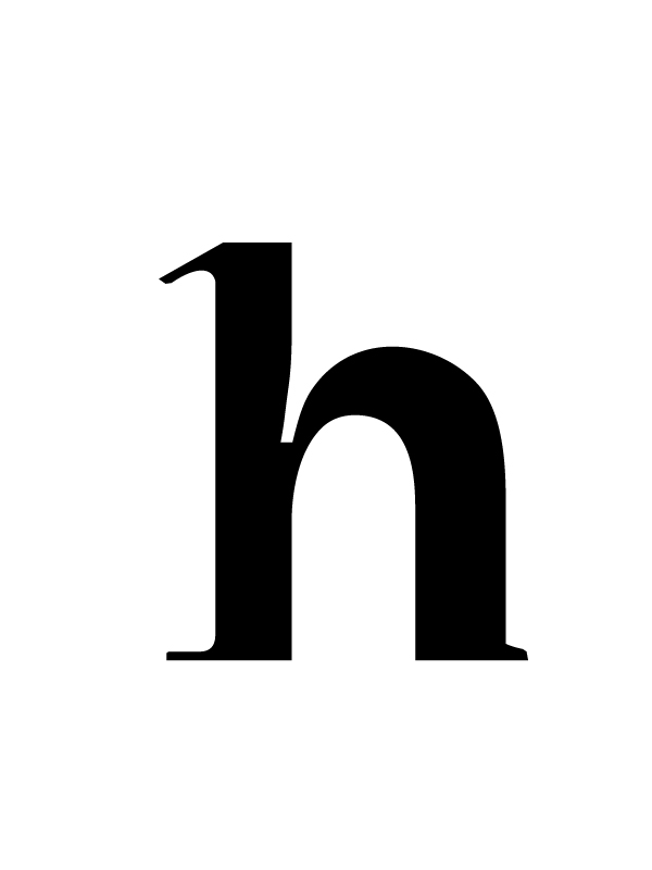
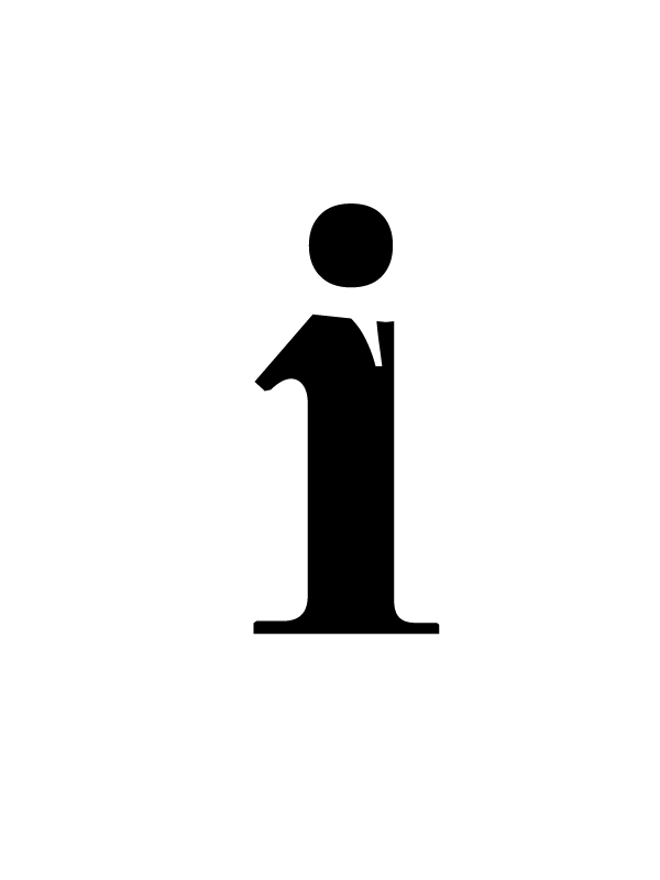
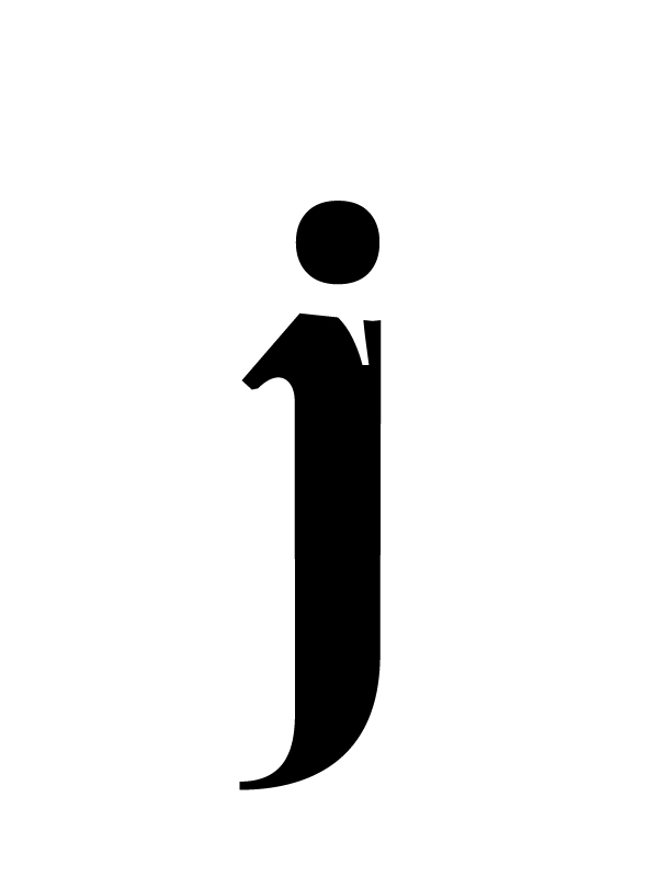
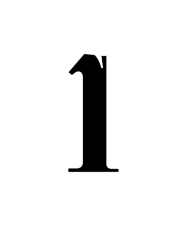
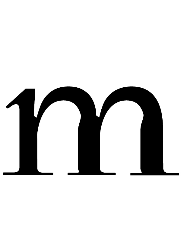
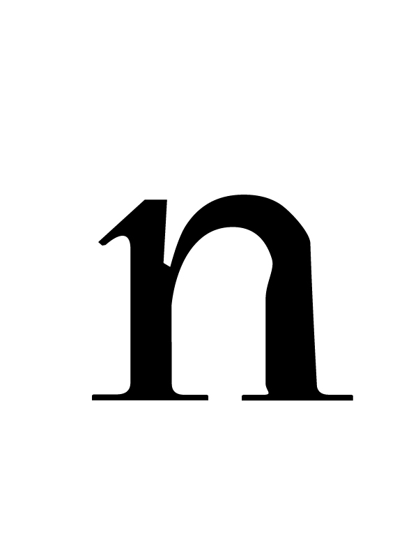
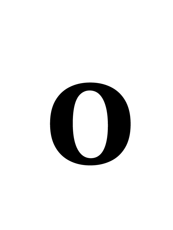
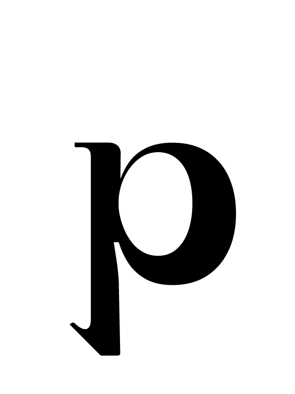
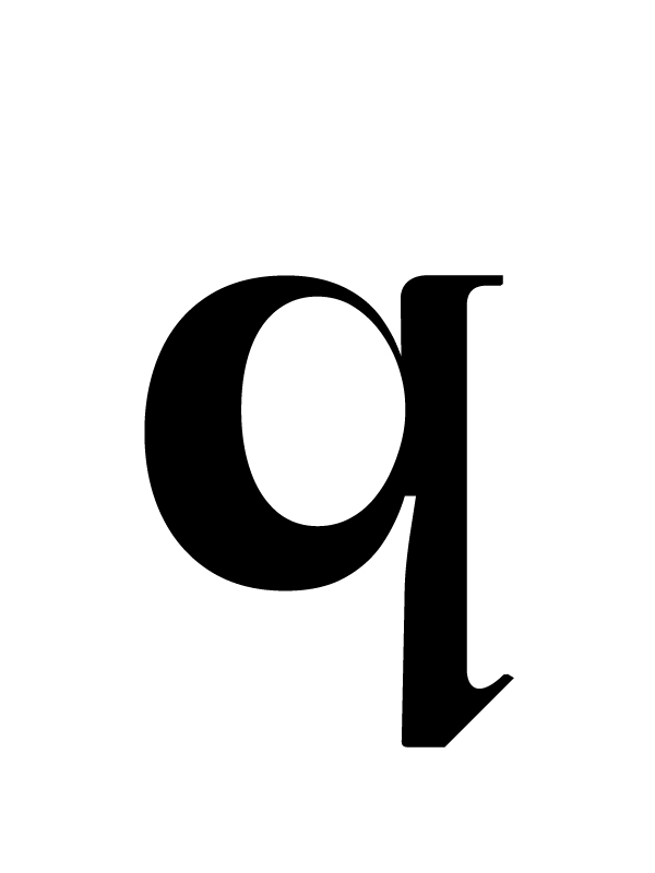
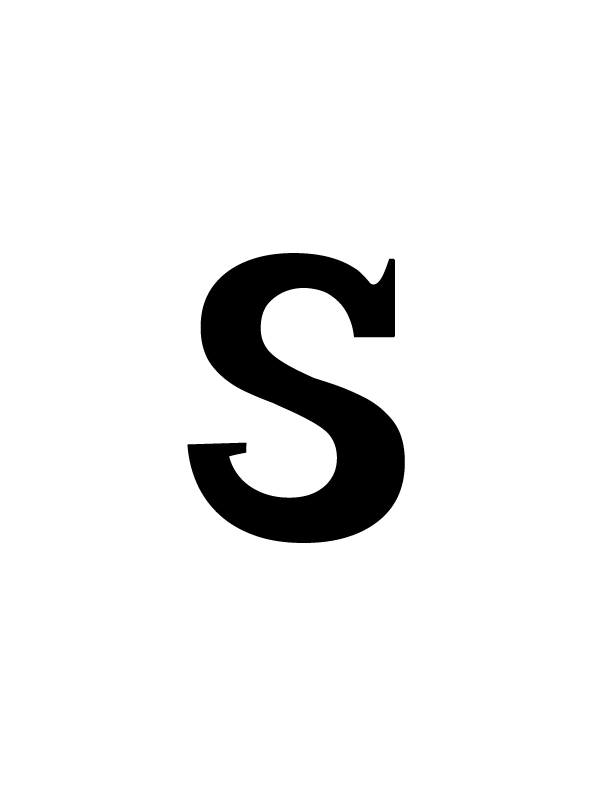
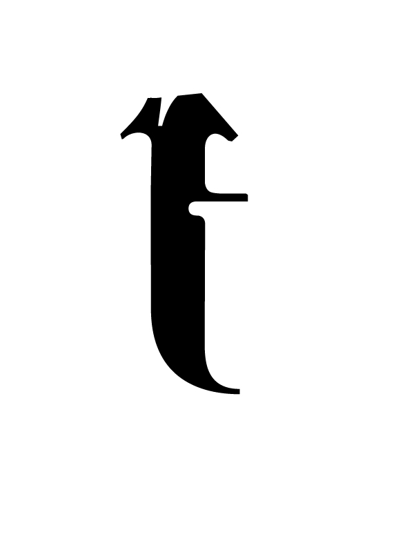
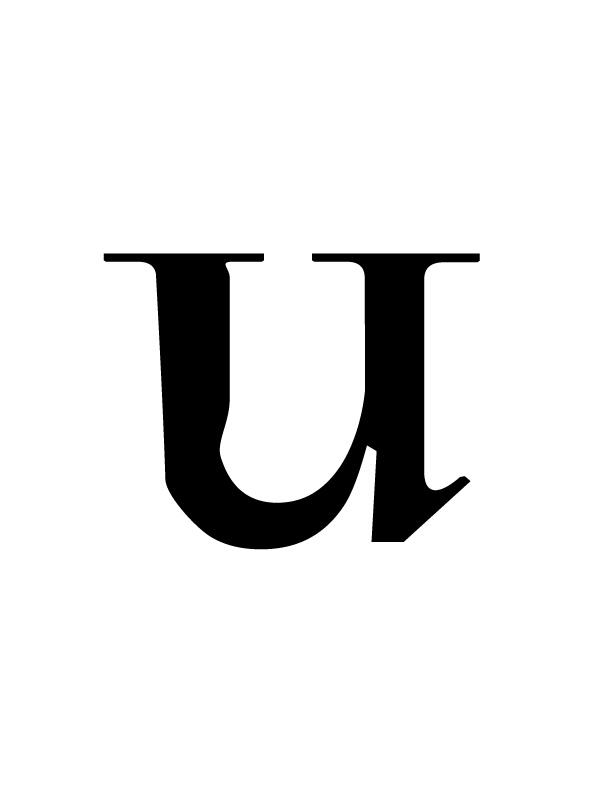
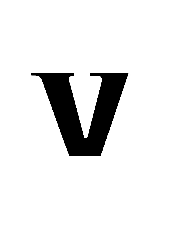
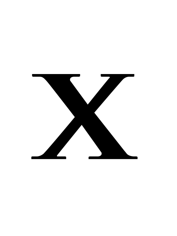
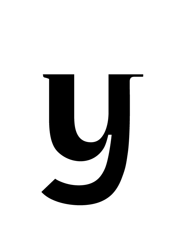
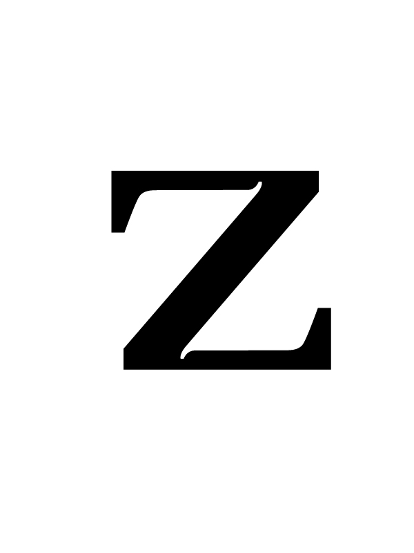
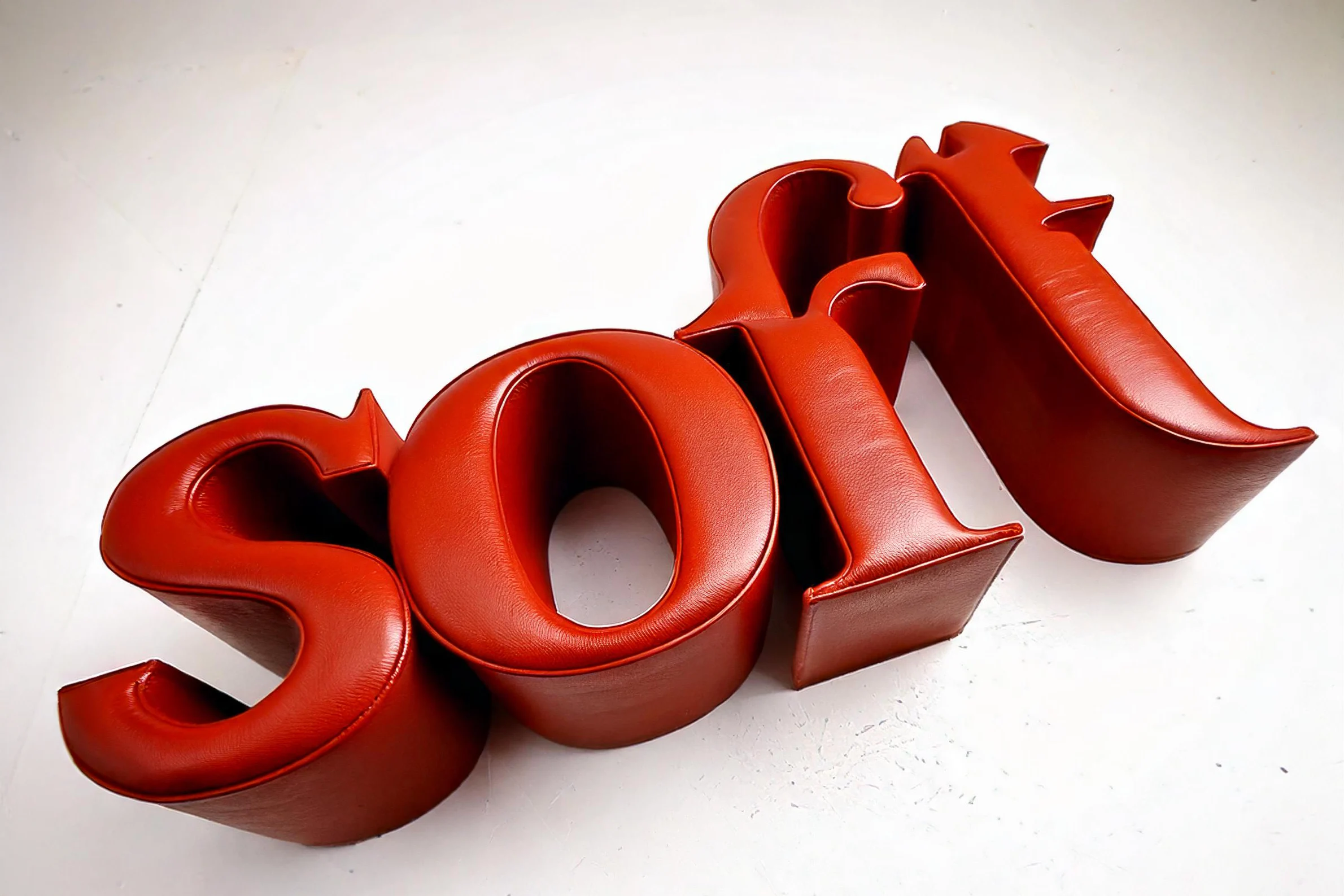
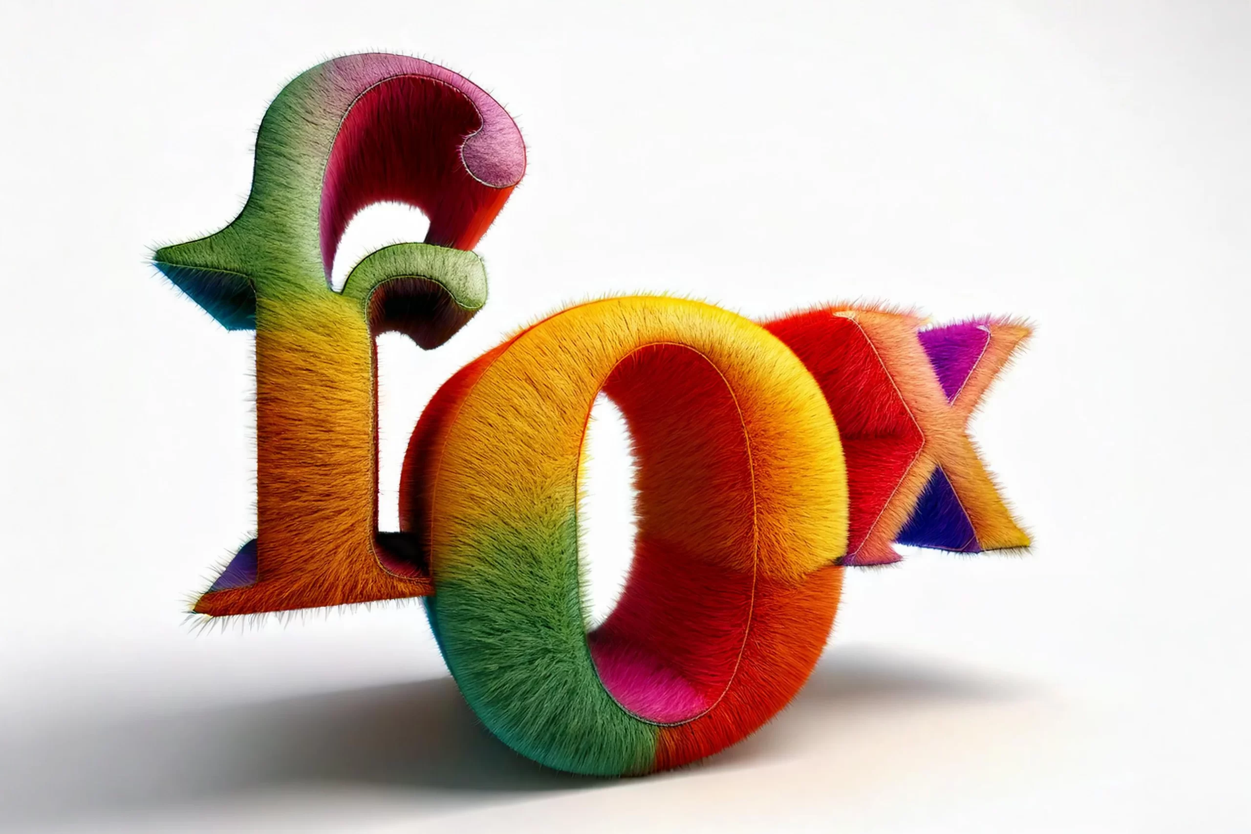
“Otoño” or “El glorioso otoño de Tirakas” (Spanish) translates to “Tirakas’s Glorious Autumn.” This serif font was initially crafted with only lettercase letters.
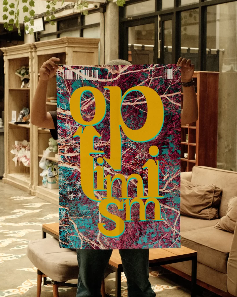
This typeface is part of a collection of four distinct typefaces, each resonating with one of the four seasons, and this particular one encapsulates the essence of autumn. This an ongoing project to fully design all the letters and numerals.
This typeface was meticulously shaped using a grid in Illustrator. Letterforms were designed to resonate with Art Nouveau and classic typefaces like Didot. Generative AI was used to visualize and explore how the typeface could potentially be applied to various materials in physical objects, industrial design, or commercials.
Though typeface design takes years to master, the type closely follows the anatomy of professional typefaces. Despite designing only lettercase, careful attention was given to the baseline, stems, strokes, ascenders, descenders, and other essential elements to create a captivating typeface. This project serves as a foundation for developing more sophisticated typeface designs in the future.